This vignette will demonstrate pmxhelpr functions for
exploratory data analysis.
First load the required packages.
options(scipen = 999, rmarkdown.html_vignette.check_title = FALSE)
library(pmxhelpr)
library(dplyr, warn.conflicts =  FALSE)
library(ggplot2, warn.conflicts =  FALSE)
library(forcats, warn.conflicts = FALSE)
library(Hmisc, warn.conflicts = FALSE)
library(patchwork, warn.conflicts = FALSE)
library(PKNCA, warn.conflicts = FALSE)
Data
The datasets used in this vignette are based on a simple ascending dose (SAD) study of an orally drug product with a parallel group food effect (FE) cohort.
data_sad
Dataset definitions can be viewed by calling ?data_sad.
We can take a quick look at the primary dataset for this analysis
(data_ssad) using glimpse() from the
dplyr package.
glimpse(data_sad)
#> Rows: 720
#> Columns: 23
#> $ LINE    <dbl> 1, 2, 3, 4, 5, 6, 7, 8, 9, 10, 11, 12, 13, 14, 15, 16, 17, 18,…
#> $ ID      <dbl> 1, 1, 1, 1, 1, 1, 1, 1, 1, 1, 1, 1, 1, 1, 1, 1, 1, 1, 1, 1, 2,…
#> $ TIME    <dbl> 0.00, 0.00, 0.48, 0.81, 1.49, 2.11, 3.05, 4.14, 5.14, 7.81, 12…
#> $ NTIME   <dbl> 0.0, 0.0, 0.5, 1.0, 1.5, 2.0, 3.0, 4.0, 5.0, 8.0, 12.0, 16.0, …
#> $ NDAY    <dbl> 1, 1, 1, 1, 1, 1, 1, 1, 1, 1, 1, 1, 2, 2, 3, 4, 5, 6, 7, 8, 1,…
#> $ DOSE    <dbl> 10, 10, 10, 10, 10, 10, 10, 10, 10, 10, 10, 10, 10, 10, 10, 10…
#> $ AMT     <dbl> NA, 10, NA, NA, NA, NA, NA, NA, NA, NA, NA, NA, NA, NA, NA, NA…
#> $ EVID    <dbl> 0, 1, 0, 0, 0, 0, 0, 0, 0, 0, 0, 0, 0, 0, 0, 0, 0, 0, 0, 0, 0,…
#> $ ODV     <dbl> NA, NA, NA, 2.02, 4.02, 3.50, 7.18, 9.31, 12.46, 13.43, 12.11,…
#> $ LDV     <dbl> NA, NA, NA, 0.7031, 1.3913, 1.2528, 1.9713, 2.2311, 2.5225, 2.…
#> $ CMT     <dbl> 2, 1, 2, 2, 2, 2, 2, 2, 2, 2, 2, 2, 2, 2, 2, 2, 2, 2, 2, 2, 2,…
#> $ MDV     <dbl> 1, NA, 1, 0, 0, 0, 0, 0, 0, 0, 0, 0, 0, 0, 1, 1, 1, 1, 1, 1, 1…
#> $ BLQ     <dbl> -1, NA, 1, 0, 0, 0, 0, 0, 0, 0, 0, 0, 0, 0, 1, 1, 1, 1, 1, 1, …
#> $ LLOQ    <dbl> 1, NA, 1, 1, 1, 1, 1, 1, 1, 1, 1, 1, 1, 1, 1, 1, 1, 1, 1, 1, 1…
#> $ FOOD    <dbl> 0, 0, 0, 0, 0, 0, 0, 0, 0, 0, 0, 0, 0, 0, 0, 0, 0, 0, 0, 0, 0,…
#> $ SEXF    <dbl> 1, 1, 1, 1, 1, 1, 1, 1, 1, 1, 1, 1, 1, 1, 1, 1, 1, 1, 1, 1, 1,…
#> $ RACE    <dbl> 2, 2, 2, 2, 2, 2, 2, 2, 2, 2, 2, 2, 2, 2, 2, 2, 2, 2, 2, 2, 1,…
#> $ AGEBL   <int> 25, 25, 25, 25, 25, 25, 25, 25, 25, 25, 25, 25, 25, 25, 25, 25…
#> $ WTBL    <dbl> 82.1, 82.1, 82.1, 82.1, 82.1, 82.1, 82.1, 82.1, 82.1, 82.1, 82…
#> $ SCRBL   <dbl> 0.87, 0.87, 0.87, 0.87, 0.87, 0.87, 0.87, 0.87, 0.87, 0.87, 0.…
#> $ CRCLBL  <dbl> 128, 128, 128, 128, 128, 128, 128, 128, 128, 128, 128, 128, 12…
#> $ USUBJID <chr> "STUDYNUM-SITENUM-1", "STUDYNUM-SITENUM-1", "STUDYNUM-SITENUM-…
#> $ PART    <chr> "Part 1-SAD", "Part 1-SAD", "Part 1-SAD", "Part 1-SAD", "Part …
The study design consisted of two parts. Part 1 was a SAD study over a 10 to 400 mg dose range and Part 2 was a parallel 100 mg single dose food effect (FE) study.
distinct(data_sad, DOSE, PART, FOOD)
#> # A tibble: 6 × 3
#>    DOSE PART        FOOD
#>   <dbl> <chr>      <dbl>
#> 1    10 Part 1-SAD     0
#> 2    50 Part 1-SAD     0
#> 3   100 Part 1-SAD     0
#> 4   100 Part 2-FE      1
#> 5   200 Part 1-SAD     0
#> 6   400 Part 1-SAD     0
The dataset is formatted for population pharmacokinetic (PopPK)
modeling in NONMEM with oral dose events (EVID=1) input
into CMT=1 and drug concentration observations
(EVID=0) inCMT=2. Dose events are input in
AMT with the nominal dose associated with each observation
captured in DOSE.
Plasma drug concentration observations are expressed in multiple units:
-
ODV: original units of the dependent variable [ng/mL[] -
LDV: natural logarithm-transformed units of drug concentration [log(ng/mL)]
The dataset also contains multiple variables for time:
-
TIME: Actual time since first dose administration [hours] -
NTIME: Nominal time dose event or sample collection per protocol [hours] -
NDAY: Nominal day on study [day]
The actual time since first dose administration is assigned to the
NONMEM reserved variable for time (TIME), as this
represents the most accurate description of the time order of the
repeated-measures data. The nominal time varibles are exact binning
variables, which are useful for grouping data for exploratory data
analysis or model evaluation….but more on that later.
##Unique values of time variables
times <- unique(data_sad$TIME)
ntimes <- unique(data_sad$NTIME)
ntimes
#>  [1]   0.0   0.5   1.0   1.5   2.0   3.0   4.0   5.0   8.0  12.0  16.0  24.0
#> [13]  36.0  48.0  72.0  96.0 120.0 144.0 168.0

##Comparison of number of unique values of NTIME and TIME
length(ntimes)
#> [1] 19
length(times)
#> [1] 449
data_sad_pd
The companion dataset, data_sad_pd, is
data_sad with an additional pharmacodynamic (PD) response
biomarker observation type (EVID=0) in an additional
compartmentCMT=3. These response data are expressed as
percentage of baseline activity (%) in both ODV and
LDV and as percentage change from baseline activity in
CFB.
glimpse(data_sad_pd)
#> Rows: 1,404
#> Columns: 26
#> $ ID      <dbl> 1, 1, 1, 1, 1, 1, 1, 1, 1, 1, 1, 1, 1, 1, 1, 1, 1, 1, 1, 1, 1,…
#> $ TIME    <dbl> 0.00, 0.00, 0.00, 0.48, 0.48, 0.81, 0.81, 1.49, 1.49, 2.11, 2.…
#> $ NTIME   <dbl> 0.0, 0.0, 0.0, 0.5, 0.5, 1.0, 1.0, 1.5, 1.5, 2.0, 2.0, 3.0, 3.…
#> $ NDAY    <dbl> 1, 1, 1, 1, 1, 1, 1, 1, 1, 1, 1, 1, 1, 1, 1, 1, 1, 1, 1, 1, 1,…
#> $ DOSE    <dbl> 10, 10, 10, 10, 10, 10, 10, 10, 10, 10, 10, 10, 10, 10, 10, 10…
#> $ AMT     <dbl> 10, NA, NA, NA, NA, NA, NA, NA, NA, NA, NA, NA, NA, NA, NA, NA…
#> $ EVID    <dbl> 1, 0, 0, 0, 0, 0, 0, 0, 0, 0, 0, 0, 0, 0, 0, 0, 0, 0, 0, 0, 0,…
#> $ ODV     <dbl> NA, NA, 100.00000, NA, 99.87700, 2.02000, 99.44932, 4.02000, 9…
#> $ LDV     <dbl> NA, NA, 100.00000, NA, 99.87700, 0.70310, 99.44932, 1.39130, 9…
#> $ CFB     <dbl> NA, NA, 0.0000000, NA, -0.1229974, NA, -0.5506789, NA, -2.3928…
#> $ PCFB    <dbl> NA, NA, 0.000000000, NA, -0.001229974, NA, -0.005506789, NA, -…
#> $ CONC    <dbl> NA, NA, 0.00, NA, 0.00, NA, 2.02, NA, 4.02, NA, 3.50, NA, 7.18…
#> $ LINE    <dbl> 2, 1, 1, 3, 3, 4, 4, 5, 5, 6, 6, 7, 7, 8, 8, 9, 9, 10, 10, 11,…
#> $ CMT     <dbl> 1, 2, 3, 2, 3, 2, 3, 2, 3, 2, 3, 2, 3, 2, 3, 2, 3, 2, 3, 2, 3,…
#> $ MDV     <dbl> NA, 1, 1, 1, 1, 0, 0, 0, 0, 0, 0, 0, 0, 0, 0, 0, 0, 0, 0, 0, 0…
#> $ BLQ     <dbl> NA, -1, -1, 1, 1, 0, 0, 0, 0, 0, 0, 0, 0, 0, 0, 0, 0, 0, 0, 0,…
#> $ LLOQ    <dbl> NA, 1, 1, 1, 1, 1, 1, 1, 1, 1, 1, 1, 1, 1, 1, 1, 1, 1, 1, 1, 1…
#> $ FOOD    <dbl> 0, 0, 0, 0, 0, 0, 0, 0, 0, 0, 0, 0, 0, 0, 0, 0, 0, 0, 0, 0, 0,…
#> $ SEXF    <dbl> 1, 1, 1, 1, 1, 1, 1, 1, 1, 1, 1, 1, 1, 1, 1, 1, 1, 1, 1, 1, 1,…
#> $ RACE    <dbl> 2, 2, 2, 2, 2, 2, 2, 2, 2, 2, 2, 2, 2, 2, 2, 2, 2, 2, 2, 2, 2,…
#> $ AGEBL   <int> 25, 25, 25, 25, 25, 25, 25, 25, 25, 25, 25, 25, 25, 25, 25, 25…
#> $ WTBL    <dbl> 82.1, 82.1, 82.1, 82.1, 82.1, 82.1, 82.1, 82.1, 82.1, 82.1, 82…
#> $ SCRBL   <dbl> 0.87, 0.87, 0.87, 0.87, 0.87, 0.87, 0.87, 0.87, 0.87, 0.87, 0.…
#> $ CRCLBL  <dbl> 128, 128, 128, 128, 128, 128, 128, 128, 128, 128, 128, 128, 12…
#> $ USUBJID <chr> "STUDYNUM-SITENUM-1", "STUDYNUM-SITENUM-1", "STUDYNUM-SITENUM-…
#> $ PART    <chr> "Part 1-SAD", "Part 1-SAD", "Part 1-SAD", "Part 1-SAD", "Part …
df_addn
One should make sure to only pass the data of interest for visualization into any plotting function. Let’s filter to only observations, and define some grouping variables with summative information for subsequent exploratory analysis.
The helper function df_addn takes an input dataset
data and returns a dataset with the variable specified in
grp_var transformed to a factor including the count of
unique values of the identifier variable specified in
id_var (default "ID"). A string constant
separator can be added between the values in grp_var and
the count of id_var using sep. A common use is
to specify the dose units when linking dose and count of unique
individuals receiving that dose.
plot_data_pk <- data_sad %>%
  filter(EVID == 0) %>%
  mutate(`Food Status` = ifelse(FOOD == 0, "Fasted", "Fed"),
         `Dose and Food` = paste(DOSE, "mg", `Food Status`),
         Dose = DOSE) %>%
  df_addn(grp_var = "Dose", sep = "mg") %>%
  df_addn(grp_var = "Dose and Food")

plot_data_pd <- data_sad_pd %>%
  filter(EVID == 0) %>%
  mutate(`Food Status` = ifelse(FOOD == 0, "Fasted", "Fed"),
         `Dose and Food` = paste(DOSE, "mg", `Food Status`),
         Dose = DOSE) %>%
  df_addn(grp_var = "Dose", sep = "mg") %>%
  df_addn(grp_var = "Dose and Food")

unique(plot_data_pk$Dose)
#> [1] 10 mg (n=6)   50 mg (n=6)   100 mg (n=12) 200 mg (n=6)  400 mg (n=6)
#> Levels: 10 mg (n=6) 100 mg (n=12) 200 mg (n=6) 400 mg (n=6) 50 mg (n=6)
unique(plot_data_pk$`Dose and Food`)
#> [1] 10 mg Fasted (n=6)  50 mg Fasted (n=6)  100 mg Fasted (n=6)
#> [4] 100 mg Fed (n=6)    200 mg Fasted (n=6) 400 mg Fasted (n=6)
#> 6 Levels: 10 mg Fasted (n=6) 100 mg Fasted (n=6) ... 50 mg Fasted (n=6)
Unfortunately, often our factors will not be ordered in ascending
numerical order due ordering of strings. In this case, the 50 mg dose
group is sorted at the end. We can use the forcats package
in the tidyverse to quickly reorder our new variables
plot_data_pk <- plot_data_pk %>%
  mutate(Dose = fct_relevel(Dose, "50 mg (n=6)", after = 1),
         `Dose and Food` = fct_relevel(`Dose and Food`, "50 mg Fasted (n=6)", after = 1))

plot_data_pd <- plot_data_pd %>%
  mutate(Dose = fct_relevel(Dose, "50 mg (n=6)", after = 1),
         `Dose and Food` = fct_relevel(`Dose and Food`, "50 mg Fasted (n=6)", after = 1))

unique(plot_data_pk$Dose)
#> [1] 10 mg (n=6)   50 mg (n=6)   100 mg (n=12) 200 mg (n=6)  400 mg (n=6)
#> Levels: 10 mg (n=6) 50 mg (n=6) 100 mg (n=12) 200 mg (n=6) 400 mg (n=6)
unique(plot_data_pk$`Dose and Food`)
#> [1] 10 mg Fasted (n=6)  50 mg Fasted (n=6)  100 mg Fasted (n=6)
#> [4] 100 mg Fed (n=6)    200 mg Fasted (n=6) 400 mg Fasted (n=6)
#> 6 Levels: 10 mg Fasted (n=6) 50 mg Fasted (n=6) ... 400 mg Fasted (n=6)
Population Concentration-time plots
Overview of plot_dvtime
Now let’s visualize the concentration-time data!
pmxhelpr includes a function for common visualizations of
observed concentration-time data in exploratory data analysis:
plot_dvtime
Let’s run it!
plot_dvtime(plot_data_pk)
#> Error in `check_varsindf()`:
#> ! argument `dv_var` must be variables in `data`
Hmm…that didn’t work. Hmm…well checking ?plot_dvtime()
it seems that the argument dv_var specifies the dependent
variable in the dataset and the default is "DV". Since
data_sad has the original units of the dependent variable
as ODV, this name must be passed to the function.
plot_dvtime(plot_data_pk, dv_var = "ODV")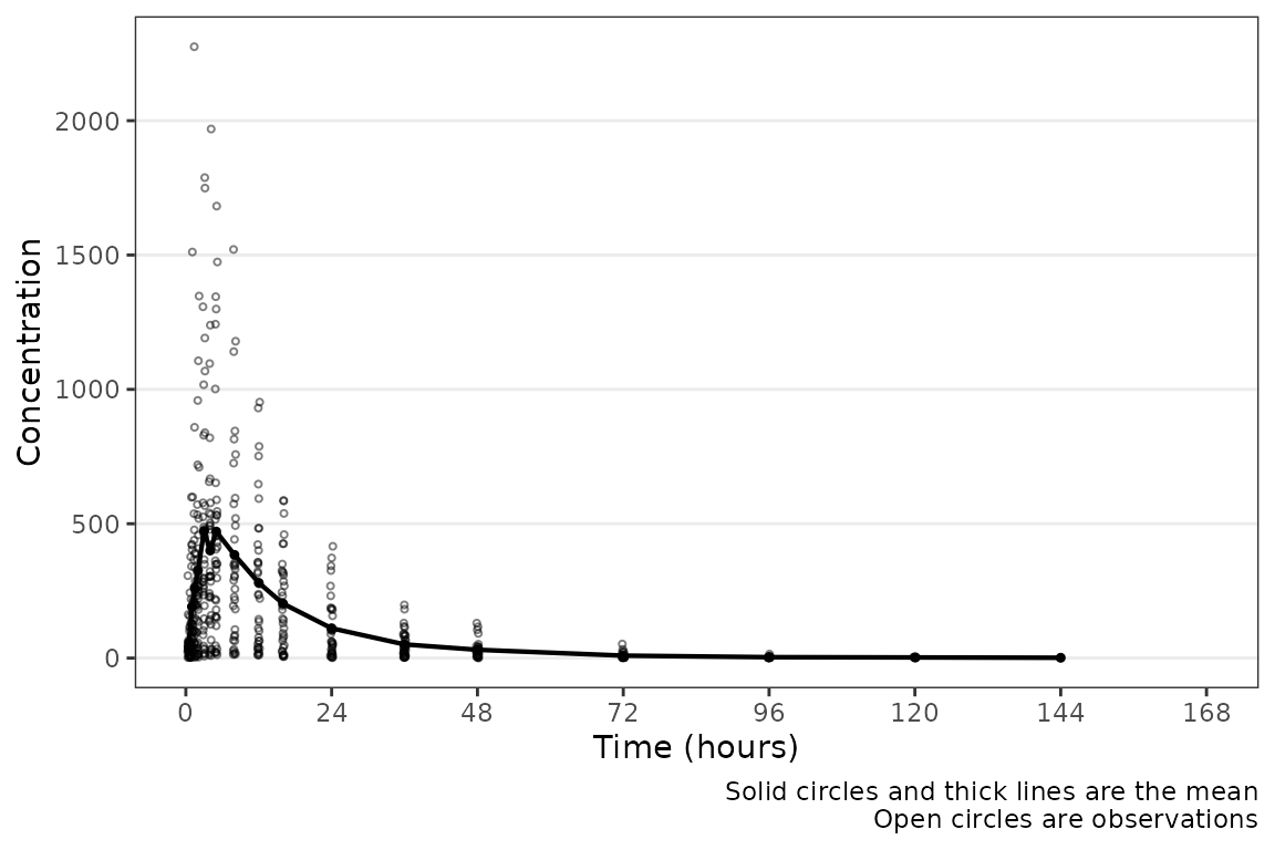 Hey a plot! Conveniently, time variables in
 data_sad had
names aligned with the default argument; however, this may not always be
the case. A caption prints by default describing the plot elements. The
caption can be removed by specifying
show_caption = FALSE.
plot_dvtime(data = plot_data_pk, dv_var = "ODV", show_caption = FALSE) 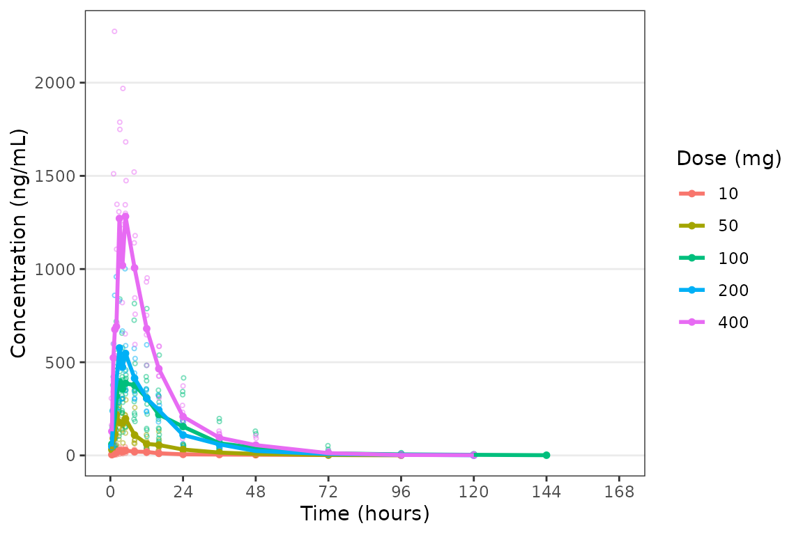
These data are probably best visualized on a log-scale y-axis
upweight the terminal phase profile. plot_dvtime includes
an argument log_y which performs this operation with some
additional formatting benefits over manually adding the layer to the
returned object with scale_y_log10.
- Includes log tick marks on the y-axis
- Updates the caption with the correct central tendency measure if
show_captions = TRUE.
plot_dvtime uses the stat_summary function
from ggplot2 to calculate and plot the central tendency
measures and error bars. An often overlooked feature of
stat_summary, is that it calculates the summary statistics
after any transformations to the data performed by changing the
scales. This means that when scale_y_log10() is applied to
the plot, the data are log-transformed for plotting and the central
tendency measure returned when requesting "mean" from
stat_summary is the geometric mean. If the
log_y argument is used to generate semi-log plots along
with show_captions = TRUE, then the caption will delineate
where arithmetic and geometric means are being returned.
plot_dvtime(data = plot_data_pk, dv_var = "ODV", log_y = TRUE) 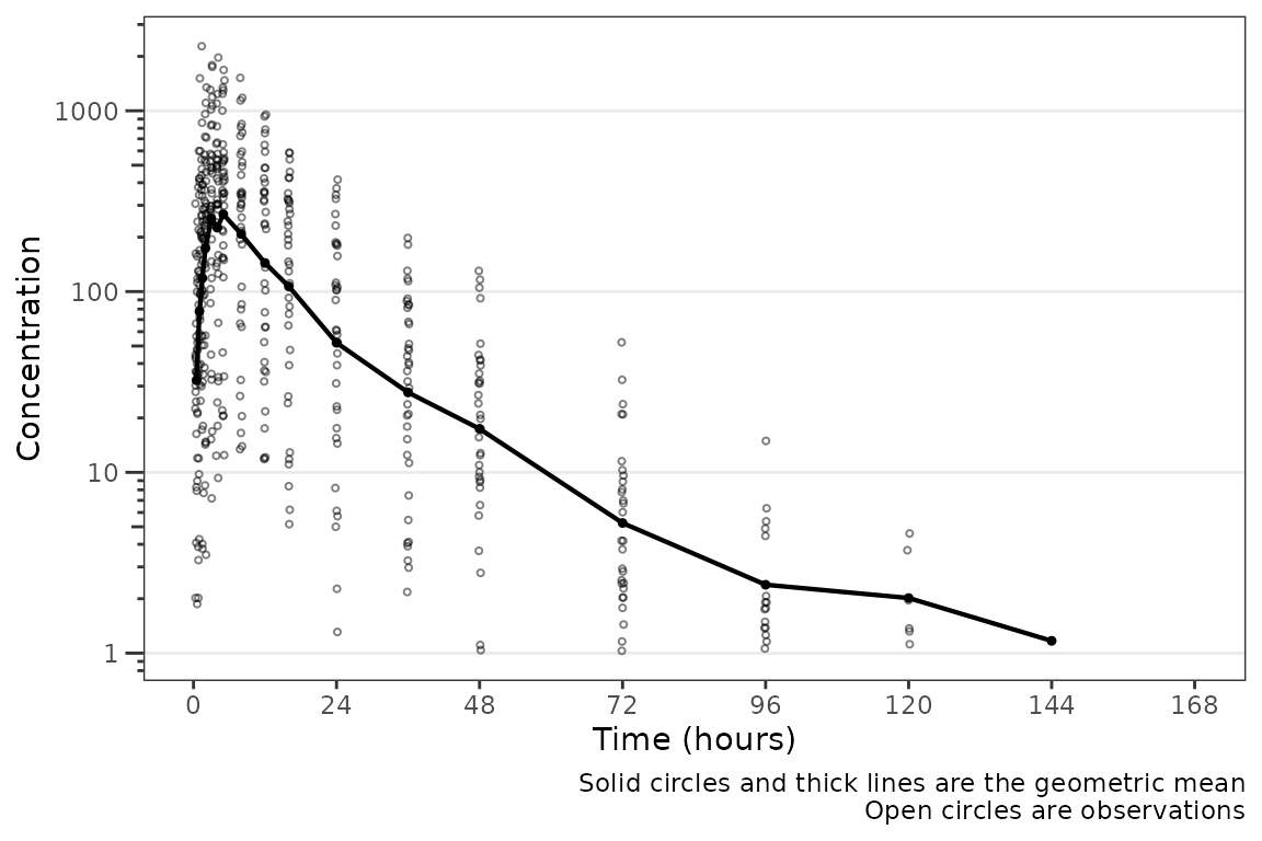
Adjusting Time Variables and Breaks
The names of the actual and nominal time variables can be passed as a
named character vector with default
time_vars=c(TIME=TIME", NTIME="NTIME"). These elements of
the argument may be specified one at a time, as in the example below
showing all nominal values, or both together.
plot_dvtime(plot_data_pk, dv_var = "ODV", time_vars = c(TIME = "NTIME"))
plot_dvtime includes uses a helper function
(breaks_time) to automatically determine x-axis breaks
based on the units of the time variable! Two arguments in
plot_dvtime are passed to breaks_time:
-
timeucharacter string specifying time units. Options include:- “hours” (default), “hrs”, “hr”, “h”
- “days”, “dys”, “dy”, “d”
- “weeks”, “wks”, “wk”, “w”
- “months”, “mons”, “mos”, “mo”, “m”
n_breaksnumber breaks requested from the algorithm. Default = 8.
Let’s pass the vector of nominal times we defined earlier into the
breaks_time function and see what we get with different
requested numbers of breaks!
breaks_time(ntimes, unit = "hours")
#> [1]   0  24  48  72  96 120 144 168
breaks_time(ntimes, unit = "hours", n = 5)
#> [1]   0  48  96 144
breaks_time(ntimes, unit = "hours", n = length(ntimes))
#>  [1]   0.0   9.6  19.2  28.8  38.4  48.0  57.6  67.2  76.8  86.4  96.0 105.6
#> [13] 115.2 124.8 134.4 144.0 153.6 163.2
We can see that the default (n = 8) gives an optimal number of breaks
in this case whereas reducing the number of breaks (n=5) gives a less
optimal distribution of values. Requesting breaks equal to the length of
the vector of unique NTIMES will generally produce too many
breaks. The default axes breaks behavior can always be overwritten by
specifying the axis breaks manually using
scale_x_continuous().
The default n_breaks = 8 is a good value for
data_sad, and data_sad uses the default time
units ("hours"); therefore, explicit specification of the
n_breaks and timeu arguments is not
required.
plot_dvtime(data = plot_data_pk, dv_var = "ODV") 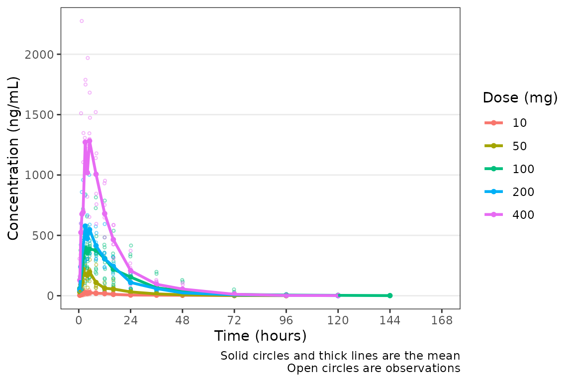 However, perhaps someone on the team would prefer the x-axis breaks in
units of
However, perhaps someone on the team would prefer the x-axis breaks in
units of days. The x-axis breaks will transform to the new
units automatically as long as we specify the new time unit with
timeu = "days".
plot_data_pk_days <- plot_data_pk %>%
  mutate(TIME = TIME/24,
         NTIME = NTIME/24)

plot_dvtime(data = plot_data_pk_days, dv_var = "ODV", timeu = "days") 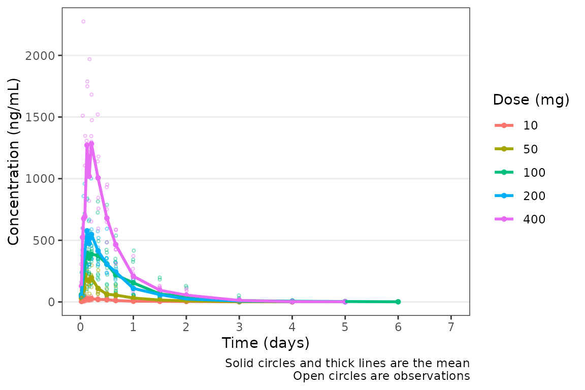
Nice! However, someone else on the team would prefer to see the first
24 hours of treatment in greater detail to visualize the absorption
phase. We can either truncate the x-axis range using
scale_x_continuous(), or filter the input data and allow
the x-axis breaks to adjust automatically with the new time range in the
input data!
plot_data_24 <- plot_data_pk %>%
  filter(NTIME <= 24)

plot_dvtime(data = plot_data_24, dv_var = "ODV") 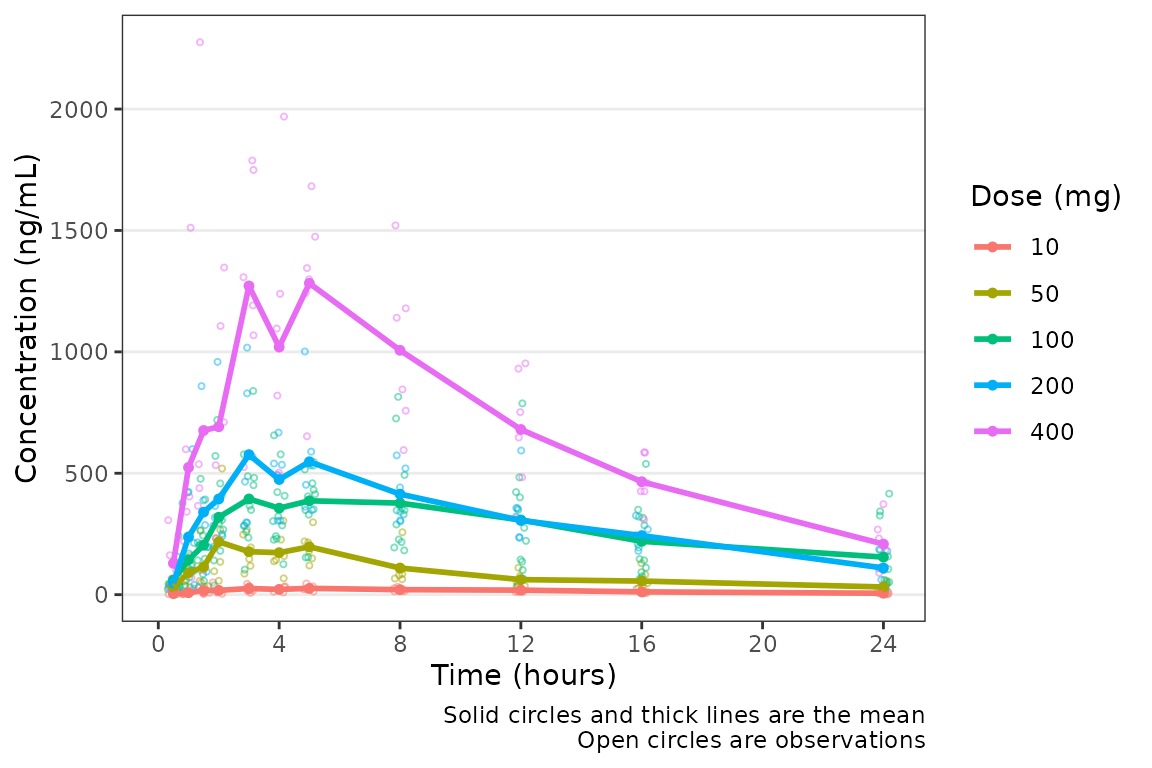
Color Aesthetic and Central Trendency
The color aesthetic can be mapped to a dataset variable using the the
col_var argument. Let’s use a variable we defined earlier
using df_addn to list unique study conditions.
plot_dvtime(data = plot_data_pk, dv_var = "ODV", log_y = TRUE, col_var = "Dose and Food", )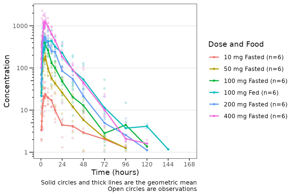 The argument
 cent specifies the method of calculating the
central tendency (+/- variability) within levels of the variable passed
to the col_var. The default is cent = "mean";
however, note that the calculation performed are after any
transformations to the data and this option will return the geometric
mean when log_y=TRUE. If the log_y argument is
used to generate semi-log plots along with
show_captions = TRUE, then the caption will automatically
delineate where arithmetic and geometric means are being returned.
plot_dvtime(data = plot_data_pk, dv_var = "ODV", col_var = "Dose and Food", cent = "mean",
ylab = "Concentration (ng/mL)") 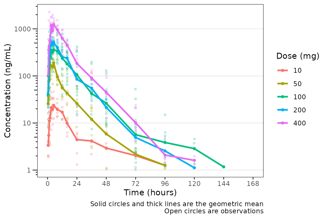
It looks like coadministration with food may impact the absorption
profile. Luckily, plot_dvtime returns a ggplot
object which we can modify like any other ggplot!
Therefore, we can facet by PART by simply adding in another layer to our
ggplot object.
plot_dvtime(data = plot_data_pk, dv_var = "ODV", col_var = "Dose and Food", cent = "mean",
            ylab = "Concentration (ng/mL)", log_y = TRUE) +
  facet_wrap(~PART)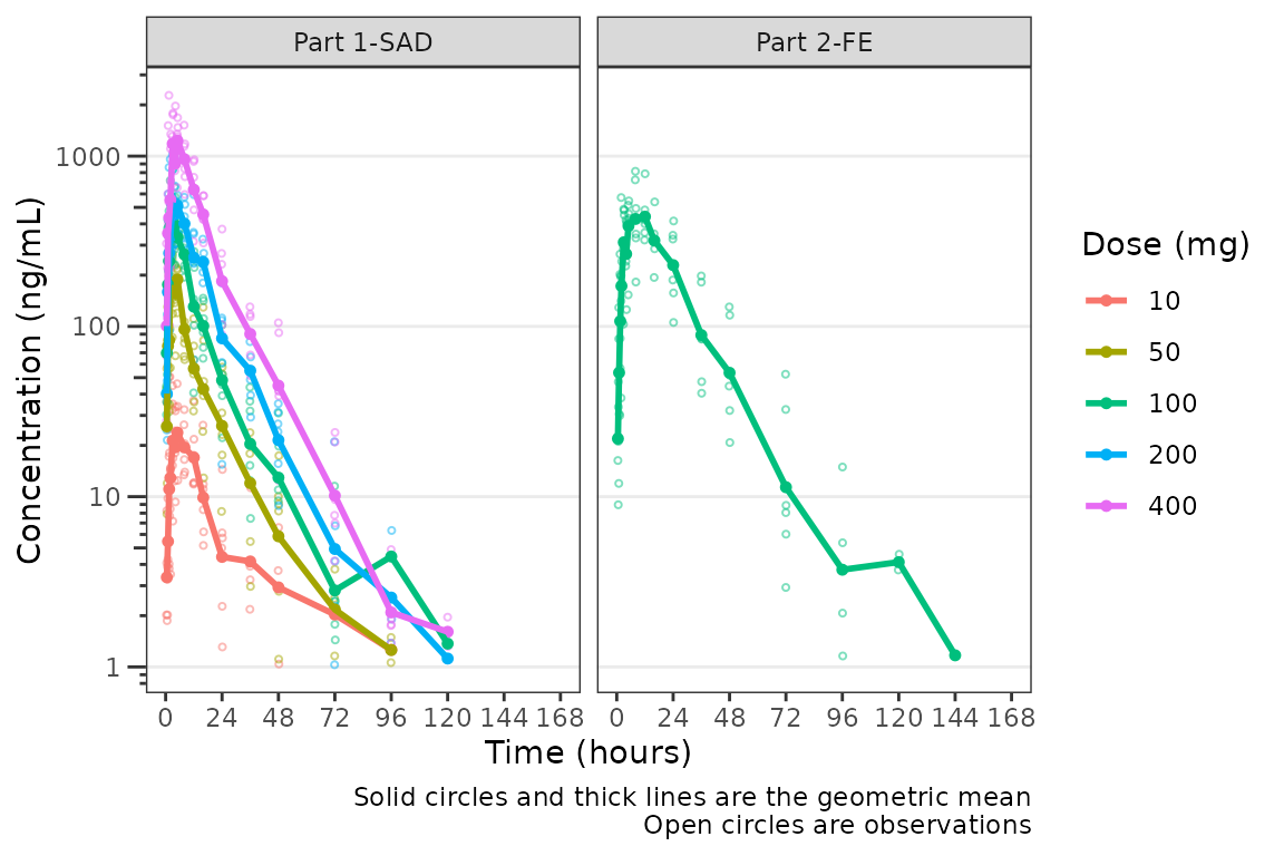
The clinical team would like a simpler plot that clearly displays the
central tendency. We can use the argument cent = "mean_sdl"
to plot the mean with error bars and remove the observed points by
specifying obs_dv = FALSE.
plot_dvtime(data = plot_data_pk, dv_var = "ODV", col_var = "Dose and Food", cent = "mean_sdl",
            ylab = "Concentration (ng/mL)", log_y = TRUE,
            obs_dv = FALSE) +
  facet_wrap(~PART)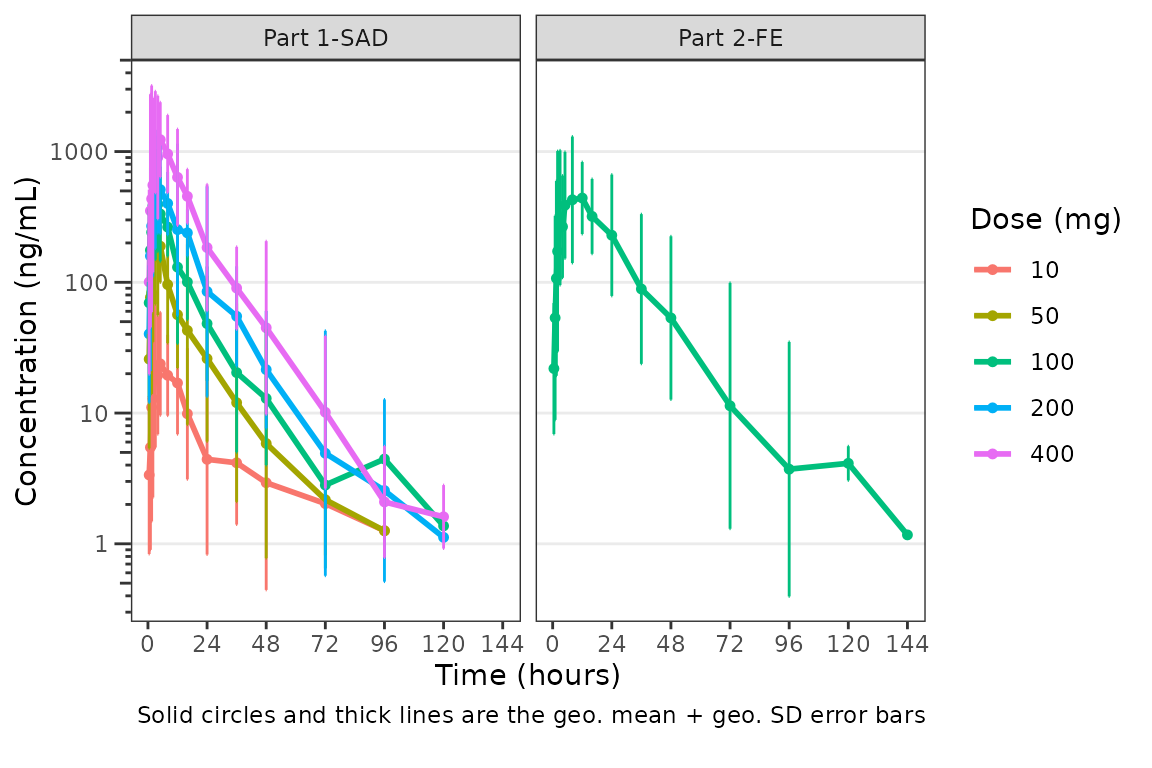
We may want to only show the upper error bar, especially when
computing the arithmetic mean +/- arithmetic SD on the linear scale.
This can be accomplished by changing the cent argument to
mean_sdl_upper.
plot_dvtime(data = plot_data_pk, dv_var = "ODV", col_var = "Dose and Food", cent = "mean_sdl_upper",
            ylab = "Concentration (ng/mL)", obs_dv = FALSE) +
  facet_wrap(~PART)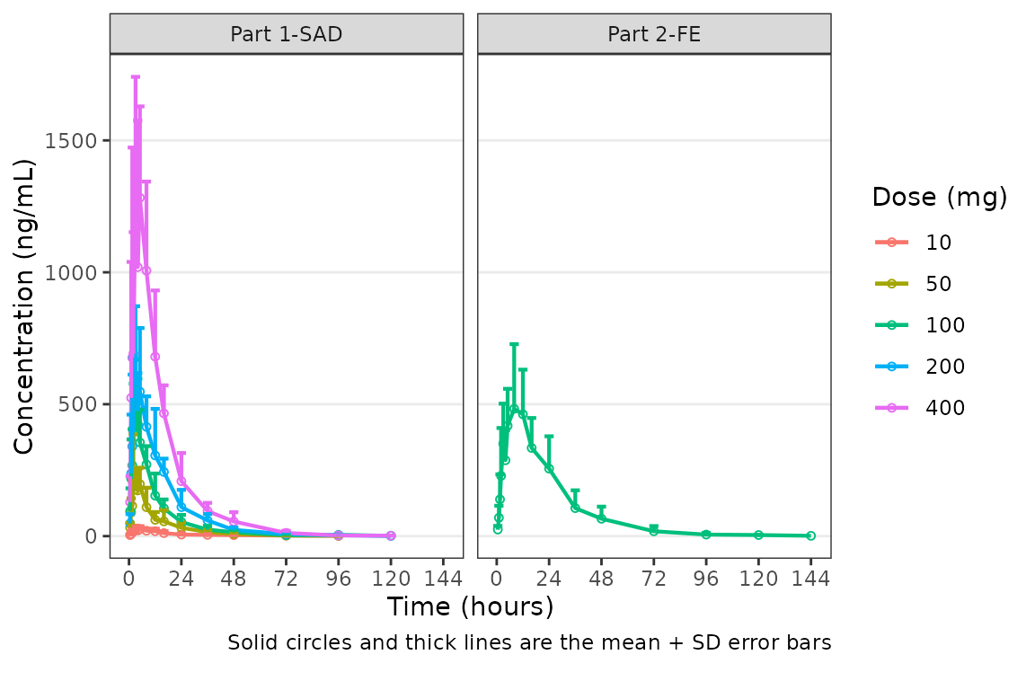
We could also plot these data as median + interquartile range (IQR),
if we do not feel the sample size is sufficient for parametric summary
statistics. This can be accomplished by changing the cent
argument to median_iqr.
plot_dvtime(data = plot_data_pk, dv_var = "ODV", col_var = "Dose and Food", cent = "median_iqr",
            ylab = "Concentration (ng/mL)", log_y = TRUE,
            obs_dv = FALSE) +
  facet_wrap(~PART)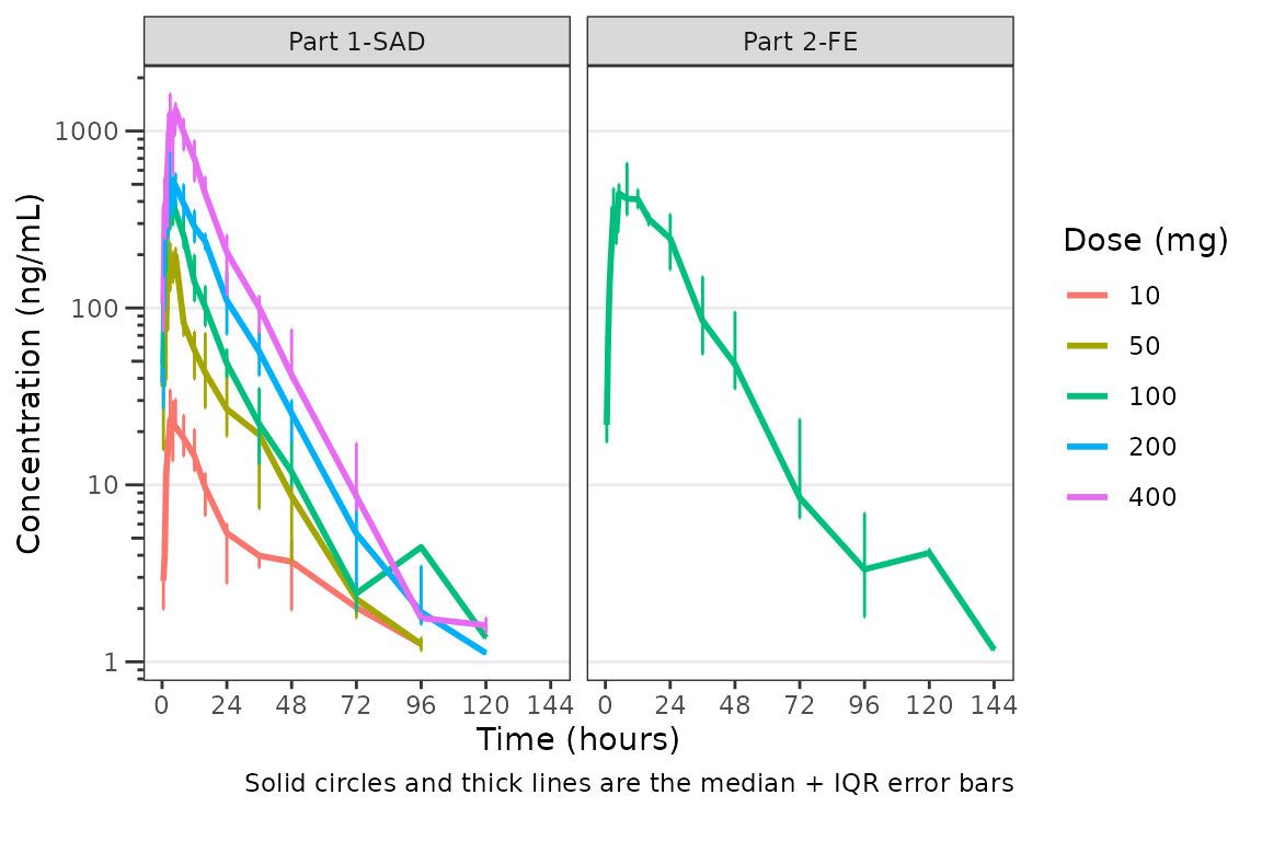
Hmm…there is some noise at the late terminal phase. This is likely artifact introduced by censoring of data at the assay LLOQ; however, let’s confirm there are no weird individual subject profiles by connecting observed data points longitudinally within a subject - in other words, let’s make spaghetti plots!
We will change the central tendency measure to the median and add the
spaghetti lines. Data points within an individual value of
grp_var will be connected by a narrow line when
grp_dv = TRUE. The default is
grp_var = "ID".
plot_dvtime(data = plot_data_pk, dv_var = "ODV", col_var = "Dose and Food", cent = "median",
ylab = "Concentration (ng/mL)", log_y = TRUE,
grp_dv = TRUE) +
facet_wrap(~PART)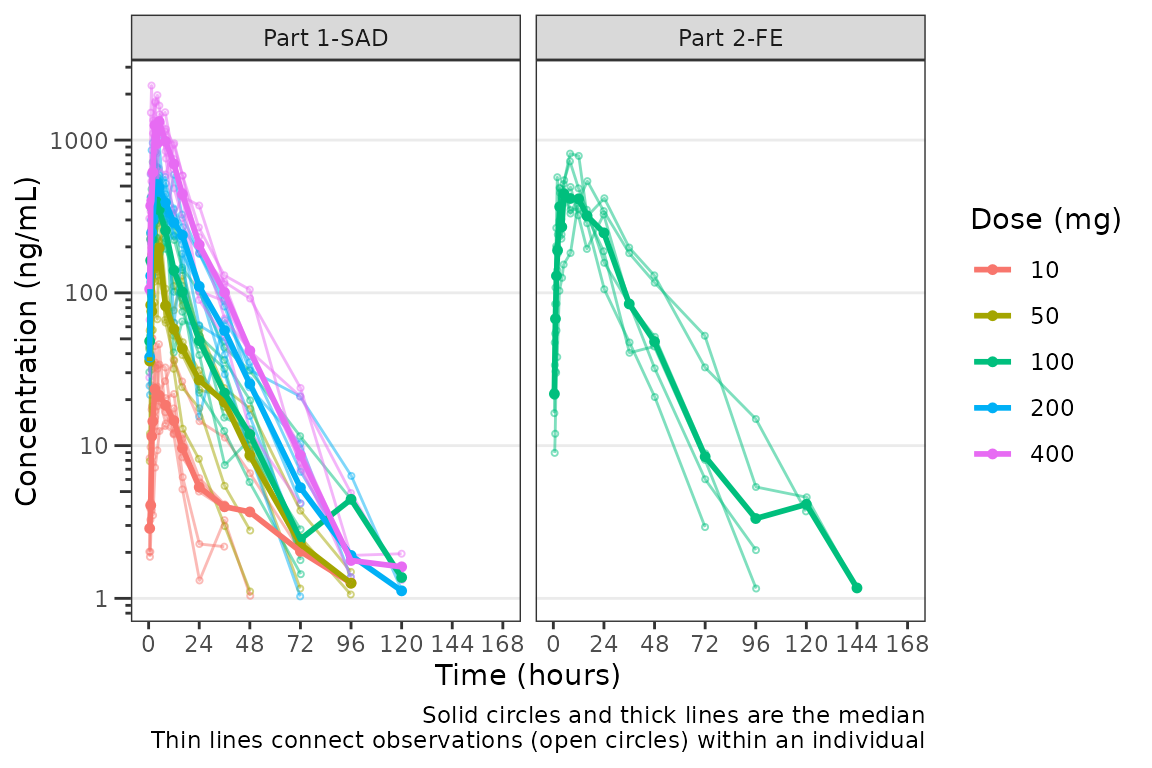 It does not seem like there are outlier individuals driving the noise in
the late terminal phase; therefore, this is almost certainly artifact
introduced by data missing due to assay sensitivity and censoring at the
lower limit of quantification (LLOQ).
It does not seem like there are outlier individuals driving the noise in
the late terminal phase; therefore, this is almost certainly artifact
introduced by data missing due to assay sensitivity and censoring at the
lower limit of quantification (LLOQ).
Defining imputations for BLQ data
Let’s use imputation to assess the potential impact of the data
missing due to assay sensitivity. plot_dvtime includes some
functionality to do this imputation for us using the loq
and loq_method arguments.
The loq_method argument species how BLQ imputation
should be performed. Options are:
-
0: No handling. Plot input datasetDVvsTIMEas is. (default) -
1: Impute all BLQ data atTIME<= 0 to 0 and all BLQ data atTIME> 0 to 1/2 xloq. Useful for plotting concentration-time data with some data BLQ on the linear scale -
2: Impute all BLQ data atTIME<= 0 to 1/2 xloqand all BLQ data atTIME> 0 to 1/2 xloq.
The loq argument species the value of the LLOQ. The
loq argument must be specified when loq_method
is 1 or 2, but can be NULL
if the variable LLOQ is present in the dataset. In
our case, LLOQ is a variable in plot_data, so
we do not need to specify the loq argument (default is
loq = NULL).
plot_dvtime(plot_data_pk, dv_var = "ODV", col_var = "Dose and Food", cent = "mean",
            ylab = "Concentration (ng/mL)", log_y = TRUE,
            loq_method = 2) +
  facet_wrap(~PART)
The same plot is obtained by specifying
 loq = 1
plot_dvtime(plot_data_pk, dv_var = "ODV", col_var = "Dose and Food", cent = "mean",
            ylab = "Concentration (ng/mL)",  log_y = TRUE,
            loq_method = 2, loq = 1) +
  facet_wrap(~PART)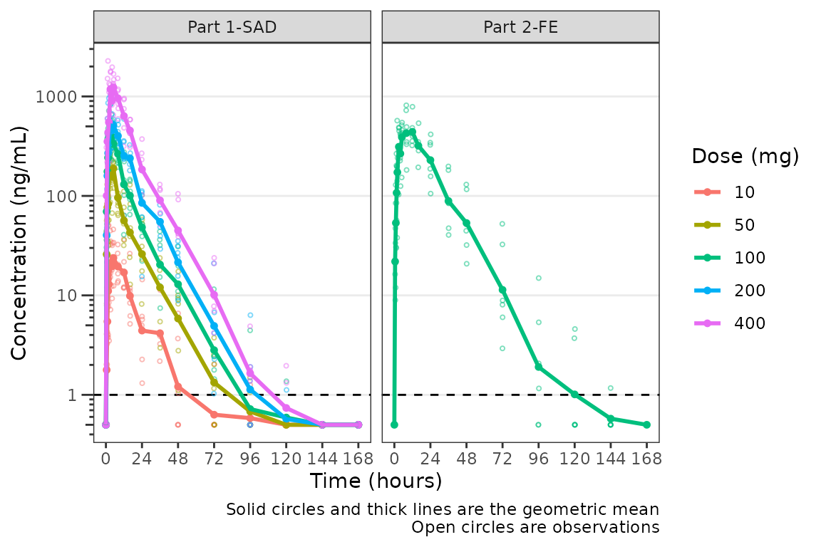
A reference line is drawn to denote the LLOQ and all observations
with EVID=0 and MDV=1 are imputed as LLOQ/2.
The numeric value of LLOQ is printed in the legend and a caption is
added to indicate the imputation method for BLQ data.
Imputing post-dose concentrations below the lower limit of quantification as 1/2 x LLOQ normalizes the late terminal phase of the concentration-time profile. This is confirmatory evidence for our hypothesis that the noise in the late terminal phase is due to censoring of observations below the LLOQ.
Dose-normalization
We can also generate dose-normalized concentration-time plots by
specifying dosenorm = TRUE.
plot_dvtime(plot_data_pk, dv_var = "ODV", col_var = "Dose and Food", cent = "mean",
            ylab = "Dose-normalized Conc. (ng/mL per mg Drug)", log_y = TRUE,
            dosenorm = TRUE) +
  facet_wrap(~PART)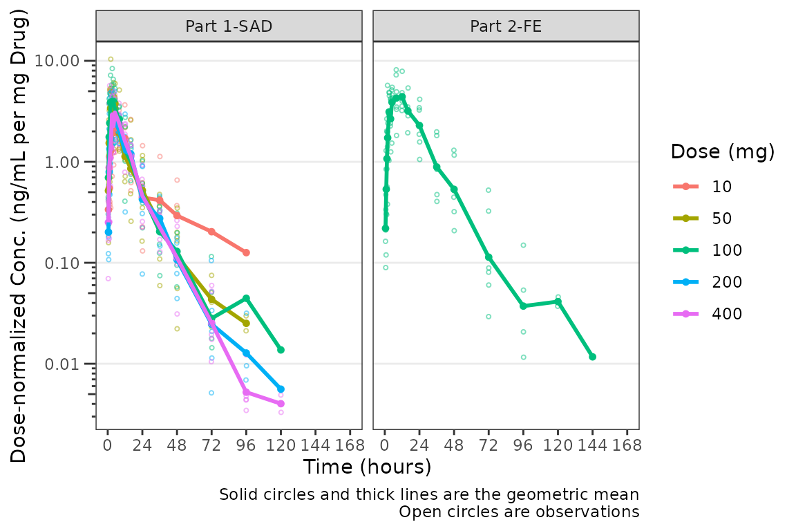
When dosenorm = TRUE, the variable specified in
dose_var (default = “DOSE”) needs to be present in the
input dataset data. If dose_var is not present
in data, the function will return an Error with an
informative error message.
plot_dvtime(select(plot_data_pk, -DOSE),
            dv_var = "ODV", col_var = "Dose and Food", cent = "mean",
            ylab = "Dose-normalized Conc. (ng/mL per mg Drug)", log_y = TRUE,
            dosenorm = TRUE) +
  facet_wrap(~PART)
#> Error in `check_varsindf()`:
#> ! argument `dose_var` must be variables in `data`
Dose-normalization is performed AFTER BLQ imputation in the case in which both options are requested. The reference line for the LLOQ will not be plotted when dose-normalized concentration is the dependent variable.
plot_dvtime(plot_data_pk, dv_var = "ODV", col_var = "Dose and Food", cent = "mean",
            ylab = "Dose-normalized Conc. (ng/mL per mg Drug)", log_y = TRUE,
            loq_method = 2, dosenorm = TRUE) +
  facet_wrap(~PART)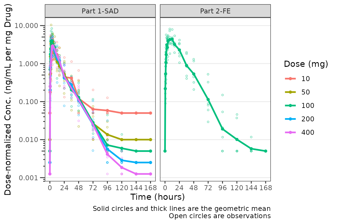
Adjusting the Attributes for Points and Lines
The default attributes of data points and lines are controlled by the
theme argument. The defaults
plot_dvtime_theme()
#> $linewidth_ref
#> [1] 0.5
#>
#> $linetype_ref
#> [1] 2
#>
#> $alpha_line_ref
#> [1] 1
#>
#> $shape_point_obs
#> [1] 1
#>
#> $size_point_obs
#> [1] 0.75
#>
#> $alpha_point_obs
#> [1] 0.5
#>
#> $linewidth_obs
#> [1] 0.5
#>
#> $linetype_obs
#> [1] 1
#>
#> $alpha_line_obs
#> [1] 0.5
#>
#> $shape_point_cent
#> [1] 16
#>
#> $size_point_cent
#> [1] 1.25
#>
#> $alpha_point_cent
#> [1] 1
#>
#> $linewidth_cent
#> [1] 0.75
#>
#> $linetype_cent
#> [1] 1
#>
#> $alpha_line_cent
#> [1] 1
#>
#> $linewidth_errorbar
#> [1] 0.75
#>
#> $linetype_errorbar
#> [1] 1
#>
#> $alpha_errorbar
#> [1] 1
#>
#> $width_errorbar
#> NULL
These attributes can be updated by passing a named list to the
theme argument. Say we want to reduce the linewidth of the
error bars and reduce the size of the mean summary points to only
visualize the lines. This can be accomplished for an individual plot as
follows:
plot_dvtime(data = plot_data_pk, dv_var = "ODV", col_var = "Dose and Food", cent = "mean_sdl",
            ylab = "Concentration (ng/mL)", log_y = TRUE,
            obs_dv = FALSE,
            theme = list(linewidth_errorbar = 0.5, size_point_cent = 0.1)) +
  facet_wrap(~PART)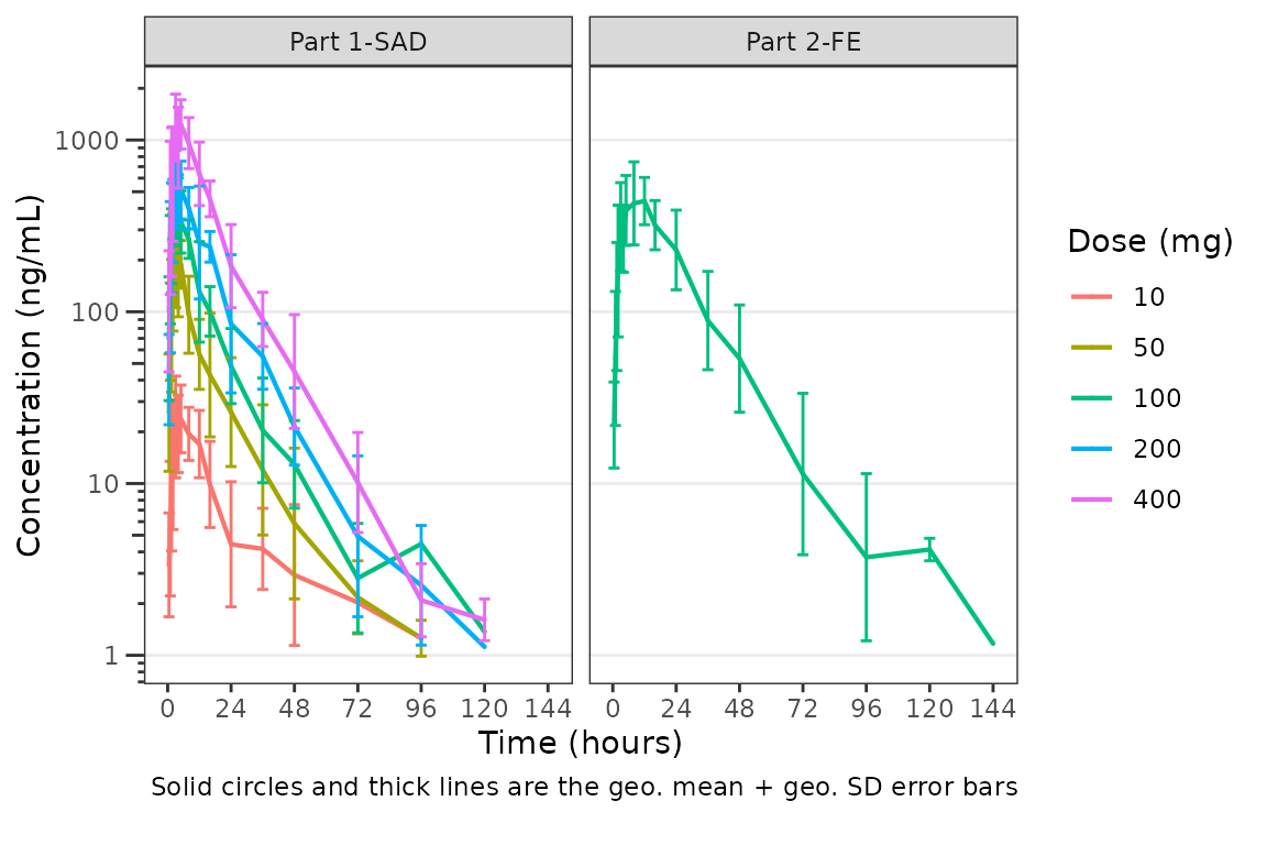
One could also globally set a new theme by updating the default using
plot_dvtime_theme and pass the new theme list object to the
theme argument. This is useful if generating multiple plots
using the same modified theme.
new_theme <- plot_dvtime_theme(list(linewidth_errorbar = 0.5, size_point_cent = 0.1))

plot_dvtime(data = plot_data_pk, dv_var = "ODV", col_var = "Dose and Food", cent = "mean_sdl",
            ylab = "Concentration (ng/mL)", log_y = TRUE,
            obs_dv = FALSE,
            theme = new_theme) +
  facet_wrap(~PART)
The default error bar width is 2.5% of the maximum nominal time in
the dataset. This can be overwritten to a user-specified value using the
width_errorbar attribute of plot_dvtime_theme.
This value is passed to the width argument of
geom_errorbar.
plot_dvtime(data = plot_data_pk, dv_var = "ODV", col_var = "Dose and Food", cent = "mean_sdl",
            ylab = "Concentration (ng/mL)", log_y = TRUE,
            obs_dv = FALSE,
            theme = list(width_errorbar = 8)) +
  facet_wrap(~PART)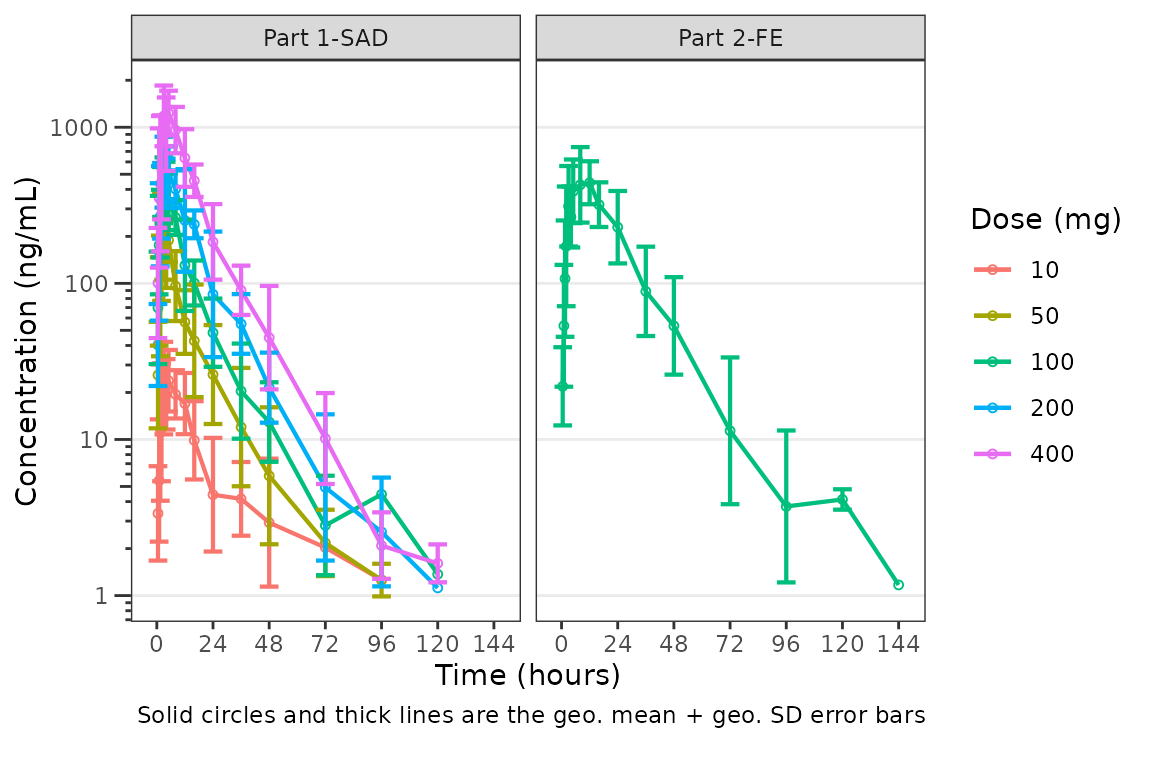
Individual Concentration-time plots
The previous section provides an overview of how to generate
population concentration-time profiles by dose using
plot_dvtime; however, we can also use
plot_dvtime to generate subject-level visualizations with a
little pre-processing of the input dataset.
We can specify cent = "none" to remove the central
tendency layer when plotting individual subject data.
plot_dvtime(plot_data_pk, dv_var = "ODV", col_var = "Dose and Food", cent = "none",
ylab = "Concentration (ng/mL)", log_y = TRUE,
grp_dv = TRUE,
loq_method = 2, loq = 1) +
facet_wrap(~PART)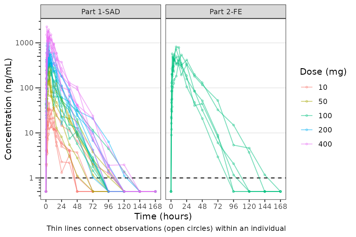 We can plot an individual subject by filtering the input dataset. This
could be extended generate plots for all individuals using
We can plot an individual subject by filtering the input dataset. This
could be extended generate plots for all individuals using
for loops, lapply, purrr::map()
functions, or other methods.
ids <- sort(unique(plot_data_pk$ID)) #vector of unique subject ids
n_ids <- length(ids) #count of unique subject ids
plots_per_pg <- 4
n_pgs <- ceiling(n_ids/plots_per_pg) #Total number of pages needed

plist<- list()
for(i in 1:n_ids){
  plist[[i]] <- plot_dvtime(filter(plot_data_pk, ID == ids[i]),
                               dv_var = "ODV", cent = "none",
            ylab = "Concentration (ng/mL)", log_y = TRUE,
            grp_dv = TRUE,
            loq_method = 2, loq = 1, show_caption = FALSE) +
  facet_wrap(~PART)+
  labs(title = paste0("ID = ", ids[i], " | Dose = ", unique(plot_data_pk$DOSE[plot_data_pk$ID==ids[i]]), " mg"))+
  theme(legend.position="none")
}

lapply(1:n_pgs, function(n_pg) {
      i <-  (n_pg-1)*plots_per_pg+1
      j <- n_pg*plots_per_pg
      wrap_plots(plist[i:j])
})
#> [[1]]
#>
#> [[2]]
#>
#> [[3]]
#>
#> [[4]]
#>
#> [[5]]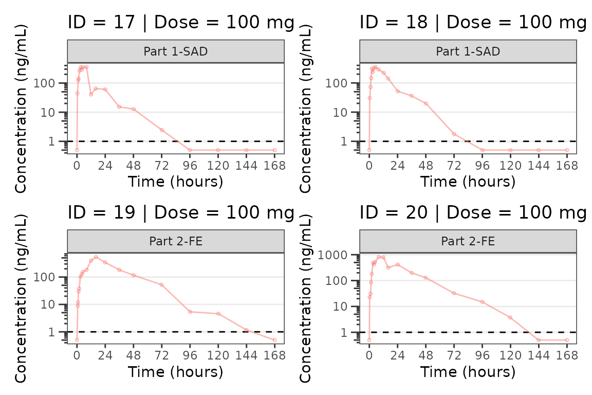
#>
#> [[6]]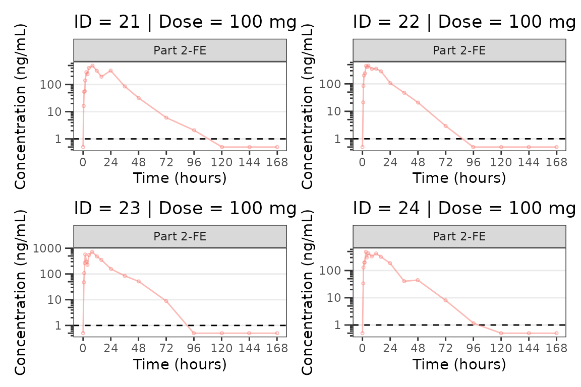
#>
#> [[7]]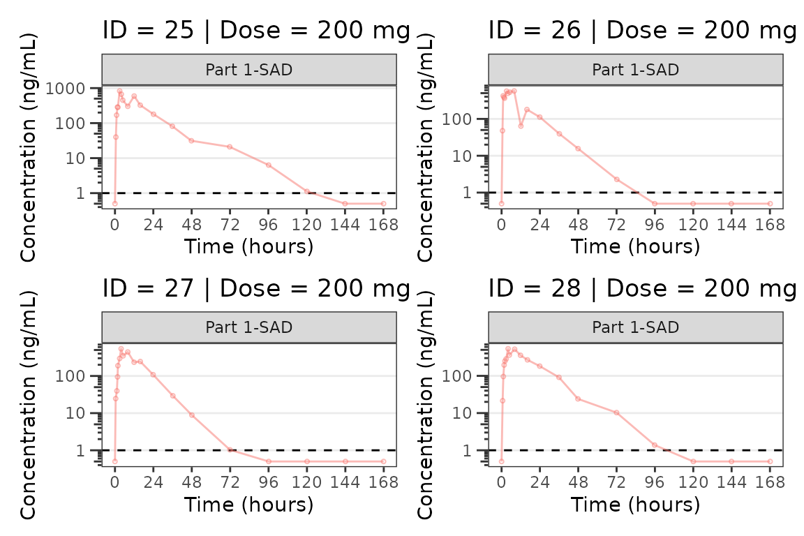
#>
#> [[8]]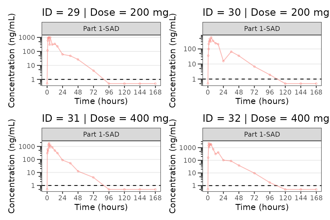
#>
#> [[9]]
Population Concentration and Response-Time Plots
Now let’s take a look at the pharmacodynamic (PD) data! We can
visualize the response-time profile using plot_dvtime, just
as we did to visualize the concentration-time profile previously, by
filtering our PK/PD dataset to the compartment with the biomarker
observations (CMT=3).
plot_dvtime(data = filter(plot_data_pd, CMT == 3), dv_var = "ODV", col_var = "Dose and Food", ylab = "Response") 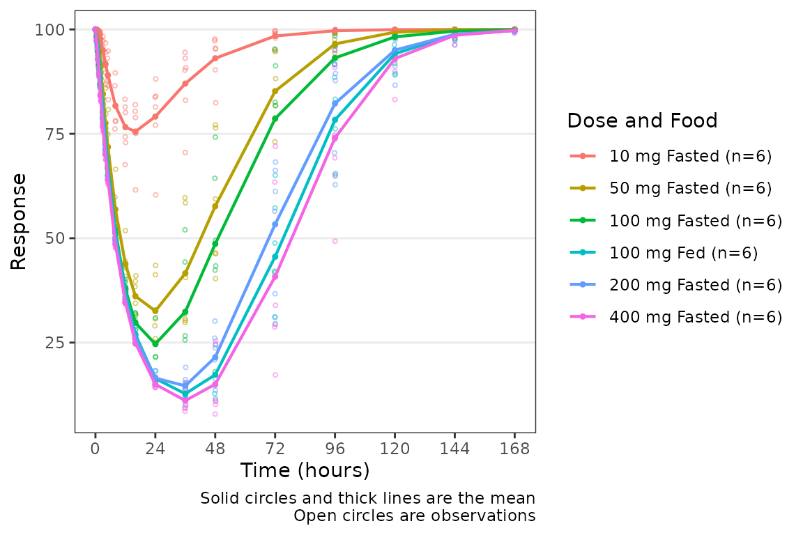
We can add a reference line to our plot using the
plot_dvtime argument cfb=TRUE, which by
default plots a reference line at y=0. The location of the reference
line can be modified by specifying a y-intercept value using the
argumentcfb_base.
plot_dvtime(data = filter(plot_data_pd, CMT == 3), dv_var = "ODV", col_var = "Dose and Food", ylab = "Response",
cfb = TRUE, cfb_base = 100) 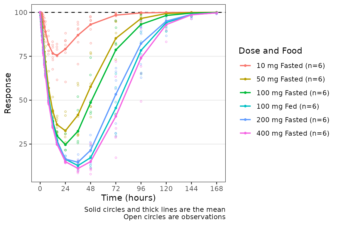
We can add a reference line to our plot using the
plot_dvtime argument cfb=TRUE, which by
default plots a reference line at y=0. The location of the reference
line can be modified by specifying a y-intercept value using the
argumentcfb_base.
plot_dvtime(data = filter(plot_data_pd, CMT == 3), dv_var = "CFB", col_var = "Dose and Food", ylab = "Response",
            cfb=TRUE)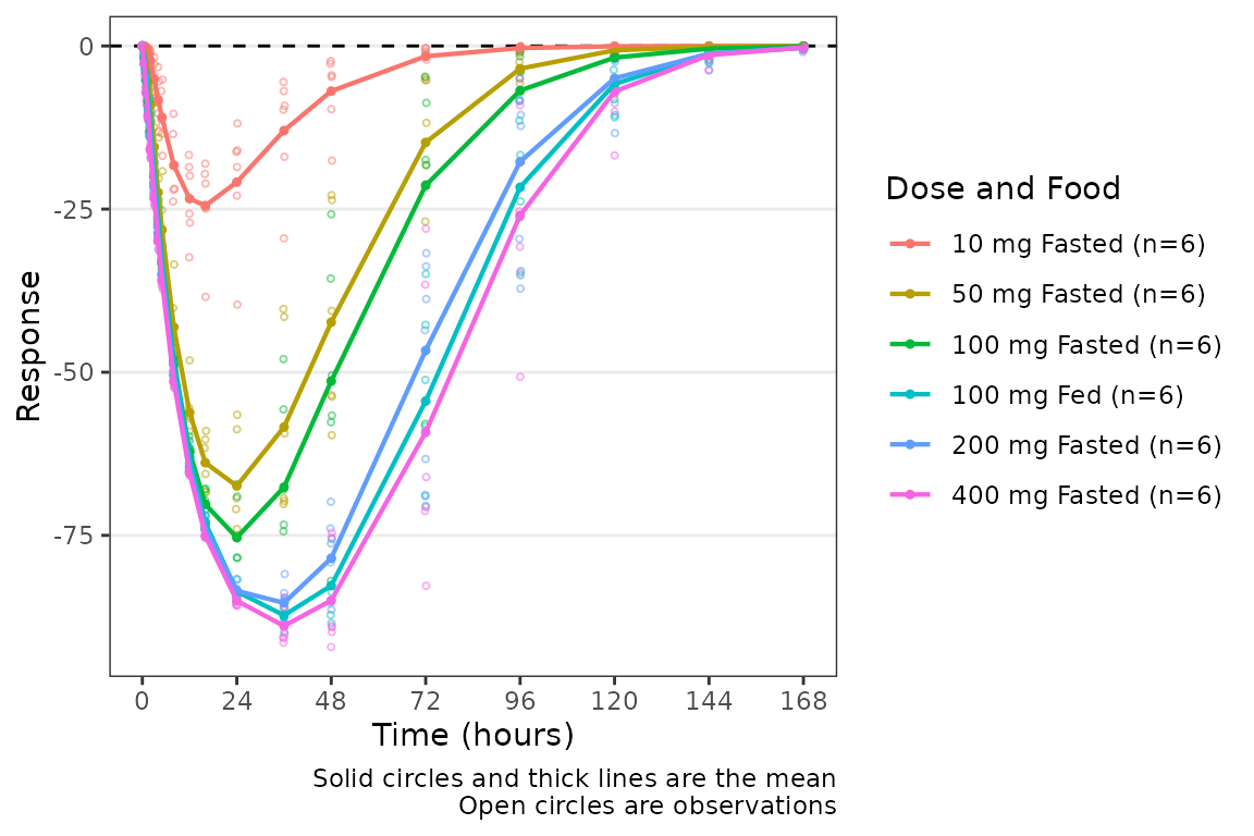
Overview of plot_dvtime_dual
The wrapper function plot_dvtime_dual supports
simultaneous visualization of the time-course of drug concentration and
response. This function uses the patchwork package to plot
the PK and PD profiles in two vertically arranged panels.
plot_dvtime_dual includes the following arguments to
specify elements of the panels:
-
dv_var1anddv_var2arguments to specify the dependent variable (y-axis) to plot in the top (1) and bottom (2) panels. The default is"DV". -
dvid_varargument to specify the variable that contains the identifiers for each dependent variable to be plotted. The default is"CMT". -
dvid_val1anddvid_val2arguments to specify the values of the variable indvid_varto identify the dependent variables to plot in the top (1) and bottom (2) panel. The defaults are2and3, respectively.
plot_dvtime_dual(plot_data_pd, dv_var1 = "ODV",dv_var2 = "ODV",
                 dvid_var = "CMT", dvid_val1 = 2, dvid_val2 = 3,
                 col_var = "Dose and Food")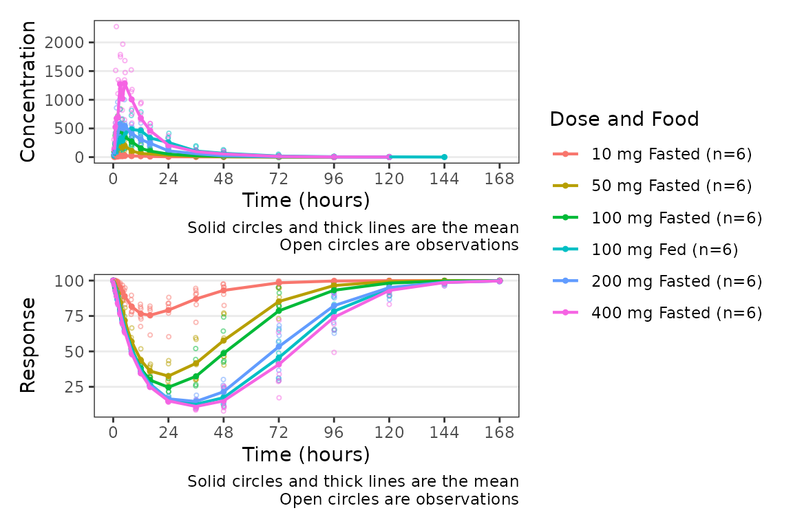
The following arguments are available to specify y-axis labels and transformations:
-
ylab1: Character string specifying the label for the top panel y-axis. Default is"Concentration". -
ylab2: Character string specifying the label for the bottom panel y-axis. Default is"Response". -
log_y1: Logical specifying if the top panel y-axis should be transformed to a log scale. Default isFALSE. -
log_y2: Logical specifying if the bottom panel y-axis should be transformed to a log scale. Default isFALSE.
plot_dvtime_dual(plot_data_pd, dv_var1 = "ODV", dv_var2 = "ODV",
                 dvid_var = "CMT", dvid_val1 = 2, dvid_val2 = 3,
                 col_var = "Dose and Food",
log_y1 = TRUE, ylab1 = "Drug Conc. (ng/mL)", ylab2 = "Response (% of Base)") 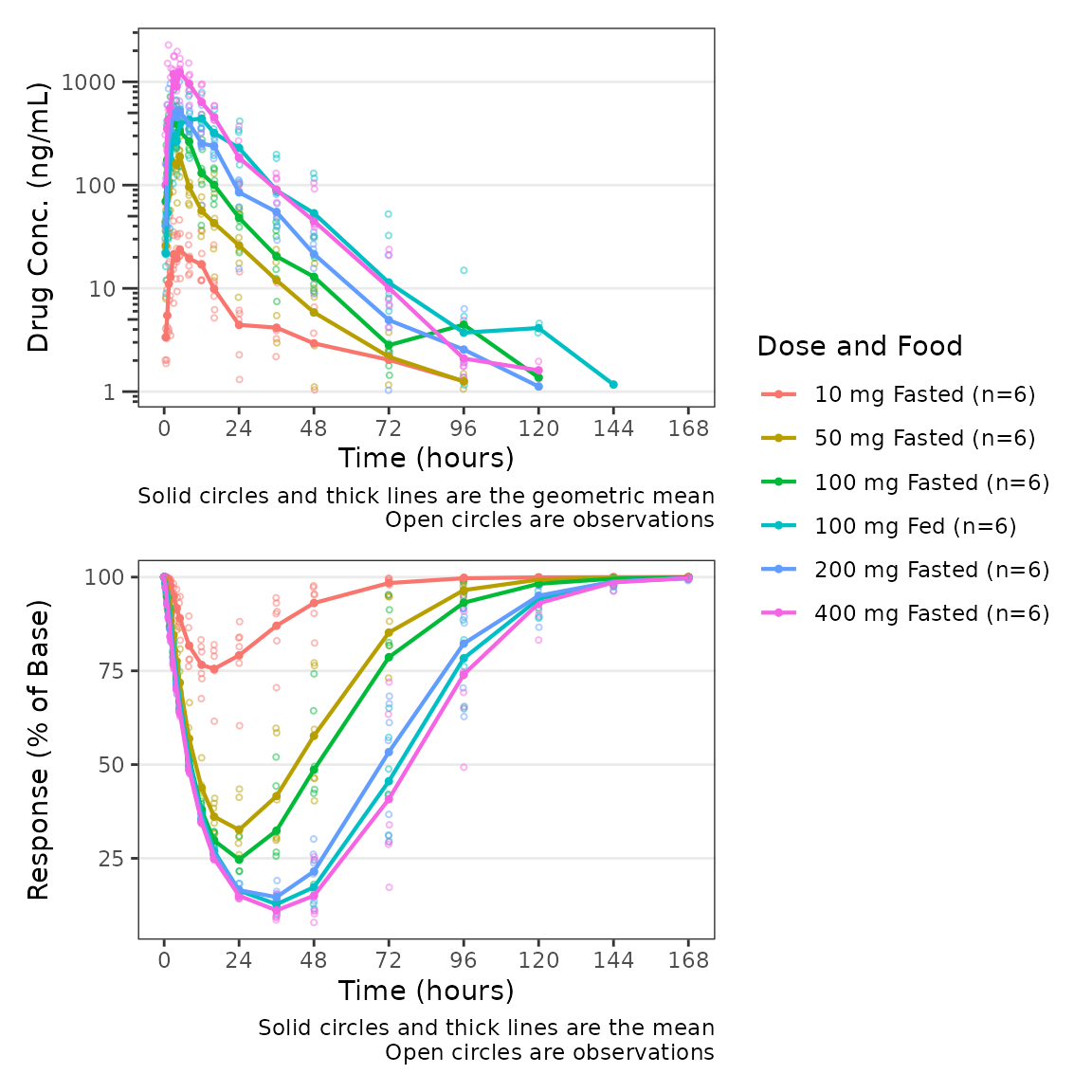
This wrapper function expects that the top panel will display drug
concentration (PK) and the bottom panel will display response (PD).
Thus, BLQ imputation and dose-normalization options specified using the
standard arguments to plot_dvtime are only applied to the
top panel.
plot_dvtime_dual(plot_data_pd, dv_var1 = "ODV", dv_var2 = "ODV",
                 dvid_var = "CMT", dvid_val1 = 2, dvid_val2 = 3,
                 col_var = "Dose and Food", loq_method = 2, dosenorm = T,dose_var = "DOSE",
log_y1 = TRUE, ylab1 = "Dose-norm Drug Conc. (ng/mL)", ylab2 = "Response (% of Base)") 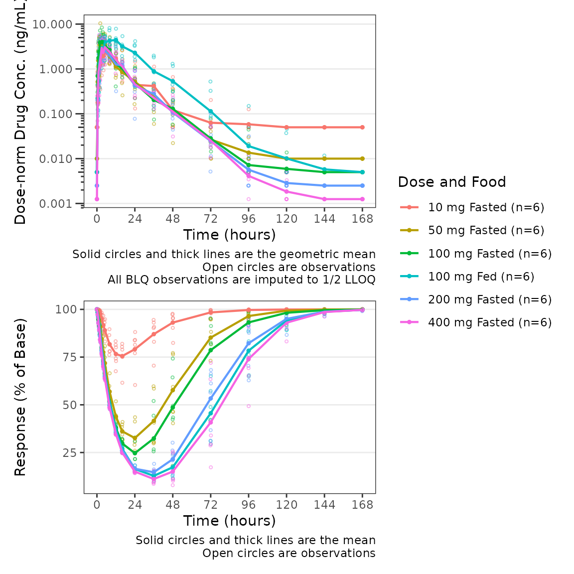
Similarly, since function expects that the bottom panel displays
response (PD), a reference line at y=cfb_base is only added
to the bottom panel when cfb=TRUE.
plot_dvtime_dual(plot_data_pd, dv_var1 = "ODV", dv_var2 = "ODV",
                 dvid_var = "CMT", dvid_val1 = 2, dvid_val2 = 3,
                 col_var = "Dose", cfb=TRUE, cfb_base = 100,
log_y1 = TRUE, ylab1 = "Drug Conc. (ng/mL)", ylab2 = "Response (% of Baseline)") 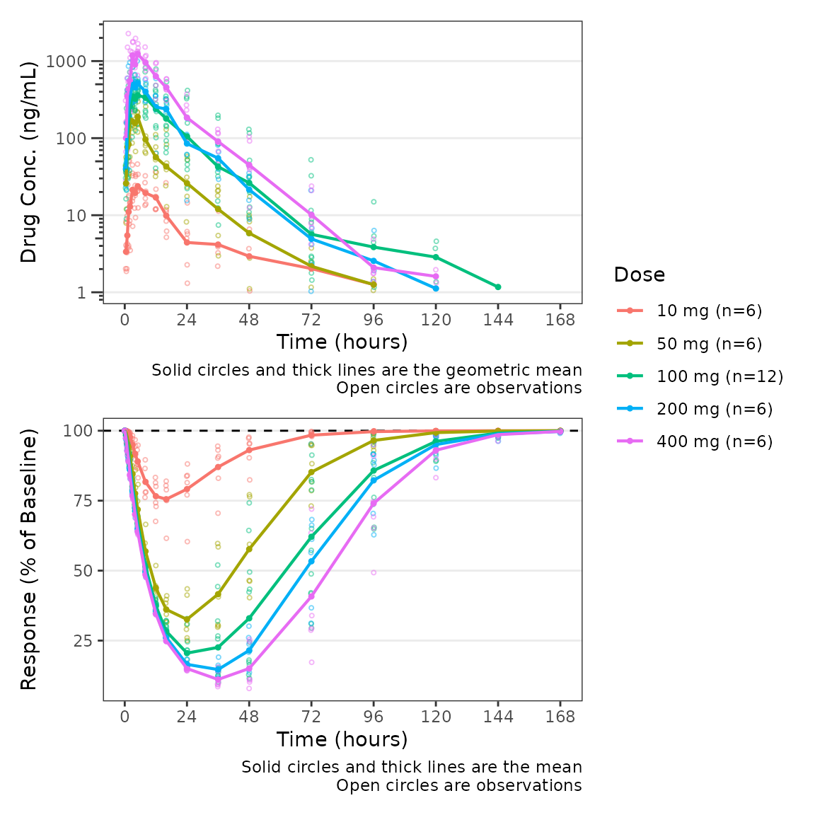
The default value of cfb_base is 0, which
is the reference condition for when we express our response variable in
units of change from baseline or percentage change from baseline. We can
modify our plot to use change from baseline as the dependent variable
for the PD panel but updating the variable passed to
dv_var2.
plot_dvtime_dual(plot_data_pd, dv_var1 = "ODV", dv_var2 = "CFB",
                 dvid_var = "CMT", dvid_val1 = 2, dvid_val2 = 3,
                 col_var = "Dose", cfb=TRUE,
log_y1 = TRUE, ylab1 = "Drug Conc. (ng/mL)", ylab2 = "Response (% Change from Baseline)") 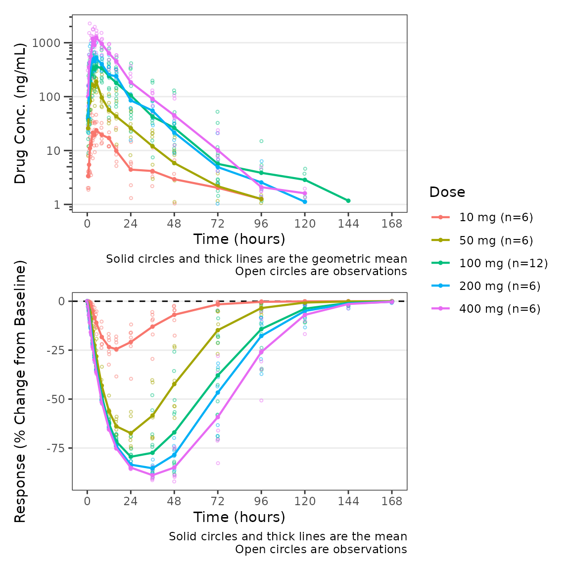
Finally, we can modify both of the captions separately using the
logical arguments show_caption1 and
show_caption2. Their default values are TRUE.
Since both panels of this plot have the same elements, we can turn the
caption off in the top panel and print a single caption under the bottom
panel to represent both panels in the plot.
plot_dvtime_dual(plot_data_pd, dv_var1 = "ODV", dv_var2 = "CFB",
                 dvid_var = "CMT", dvid_val1 = 2, dvid_val2 = 3,
                 col_var = "Dose", cfb=TRUE,
                 log_y1 = TRUE, ylab1 = "Drug Conc. (ng/mL)", ylab2 = "Response (% Change from Baseline)",
show_caption1 = FALSE, show_caption2 = TRUE) 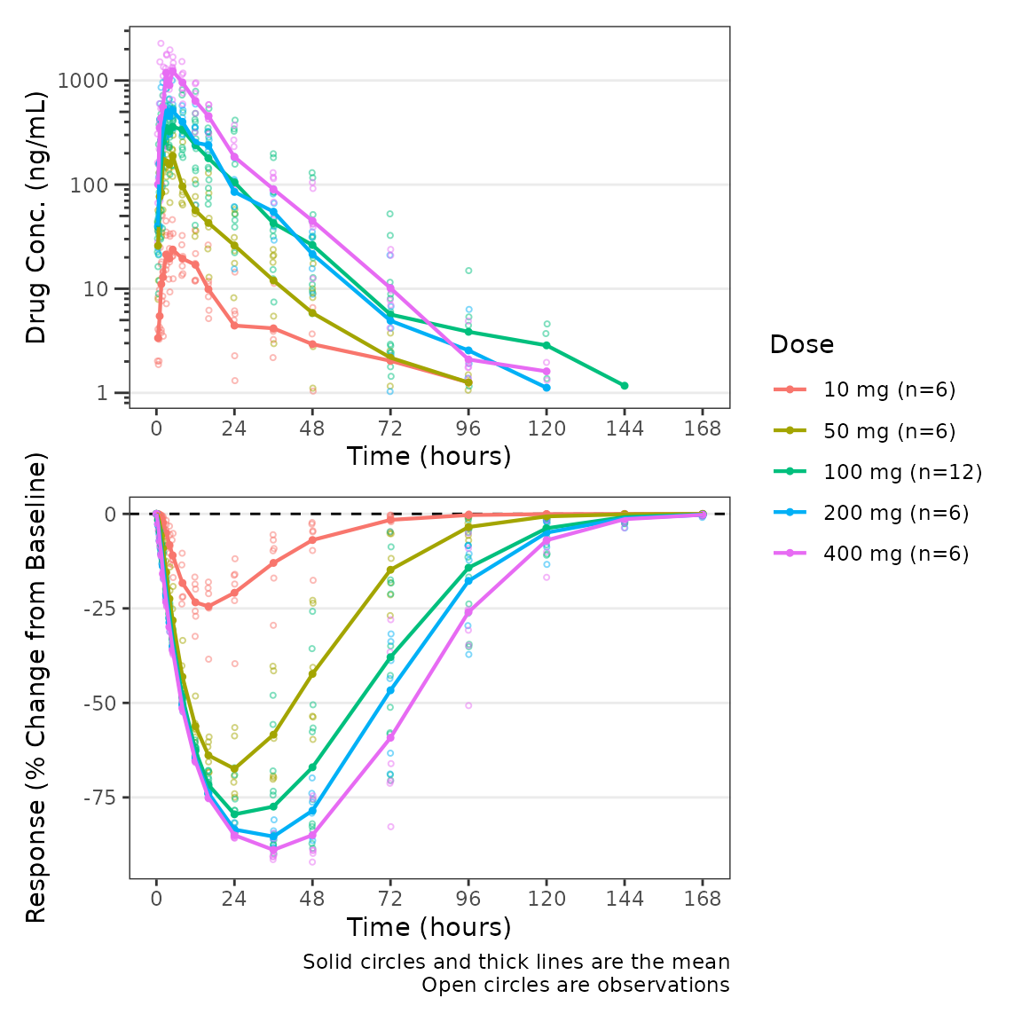
Population Response-Concentration Plots
Overview of plot_dvconc
Now that we have visualized our longitudinal PK and PD profiles,
let’s visualize the PD data versus drug concentration!
plot_dvconc is a plotting function for visualizing the
relationship between a dependent variable for response and drug
concentration.
plot_dvconc requires the following arguments which
specify the variables to be plotted:
-
dv_var: character string specifying the dependent variable to map to the y-axis. Default is"DV". -
idv_var: character string specifying the dependent variable to map to the y-axis. Default is"CONC".
plot_dvconc(data = filter(plot_data_pd, CMT==3), dv_var = "ODV", idv_var = "CONC",
xlab = "Drug Conc. (ng/mL)", ylab = "Response (% of Baseline)") 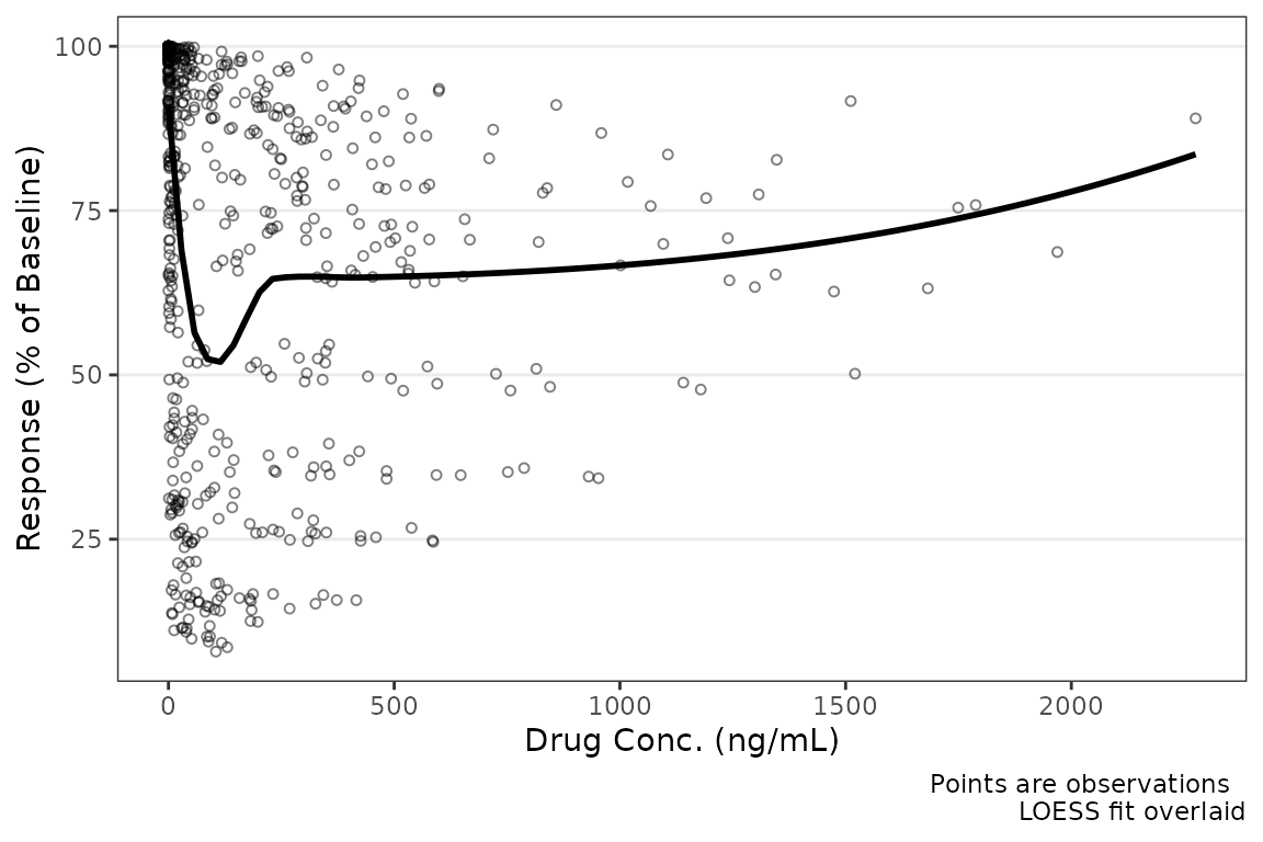
Like plot_dvtime, we can specify a reference line using
cfb = TRUE, which is plotted at cfb_base
(default = 0).
plot_dvconc(data = filter(plot_data_pd, CMT==3), dv_var = "CFB", idv_var = "CONC",
            xlab = "Drug Conc. (ng/mL)", ylab = "Response (% Change from Baseline)",
cfb = TRUE) 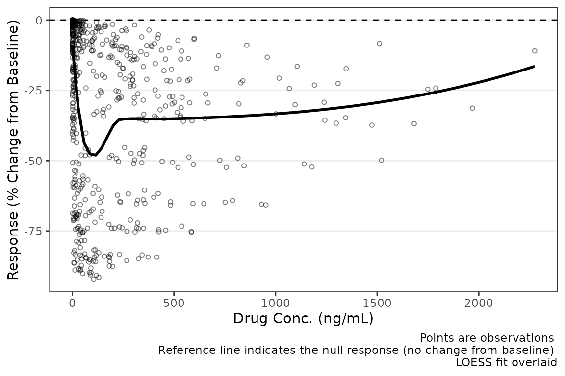
Color Aesthetic
plot_dvconc includes two arguments for controlling the
color aesthetic, col_var and col_trend. If a
variable is passed as a string to the col_var argument, the
data points are colored based on this variable; however, by default
col_trend = FALSE and the trend line is fit to the totality
of the data without stratifying the trend lines by the variable mapped
to the color aesthetic.
plot_dvconc(data = filter(plot_data_pd, CMT == 3), dv_var = "CFB", idv_var = "CONC",
            cfb = TRUE, xlab = "Drug Conc. (ng/mL)", ylab = "Response (% Change from of Baseline)",
col_var = "Dose and Food", col_trend = FALSE) 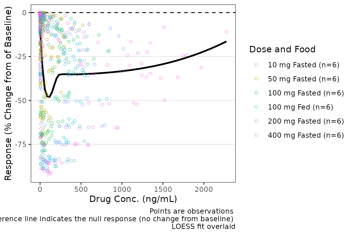
Trend lines stratified by the variable mapped to the color aesthetic
are requested by setting col_trend = TRUE.
plot_dvconc(data = filter(plot_data_pd, CMT == 3), dv_var = "CFB", idv_var = "CONC",
           cfb = TRUE,  xlab = "Drug Conc. (ng/mL)", ylab = "Response (% Change from  Baseline)",
col_var = "Dose and Food", col_trend = TRUE) 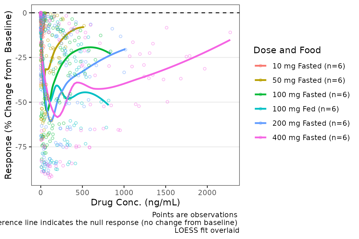
Central Tendency
There are two trend line types supported by plot_dvconc:
locally estimated scatter plot smoothing (LOESS) fit and linear
regression. The central tendency trend lines visualized are controlled
by logical arguments loess and linear. The
default is loess = TRUE and linear = FALSE
plot_dvconc(data = filter(plot_data_pd, CMT == 3), dv_var = "CFB", idv_var = "CONC",
xlab = "Drug Conc. (ng/mL)", ylab = "Response (% Change from Baseline)",
cfb = TRUE, col_var = "Dose and Food", col_trend = FALSE, loess = TRUE, linear = TRUE) 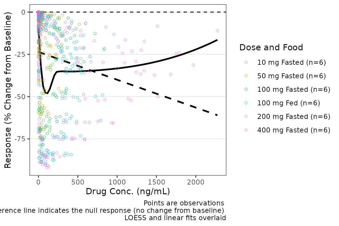 The confidence intervals of the trend lines are suppressed by default in
order to facilitate visualization of the central tendency and spread of
observed data points simultaneously. Confidence intervals can be added
to the plot using the logical arguments
The confidence intervals of the trend lines are suppressed by default in
order to facilitate visualization of the central tendency and spread of
observed data points simultaneously. Confidence intervals can be added
to the plot using the logical arguments se_loess and
se_linear.
plot_dvconc(data = filter(plot_data_pd, CMT == 3), dv_var = "CFB", idv_var = "CONC",
xlab = "Drug Conc. (ng/mL)", ylab = "Response (% Change from Baseline)",
cfb = TRUE, col_var = "Dose and Food", col_trend = FALSE,
loess = TRUE, linear = TRUE, se_loess = TRUE, se_linear = TRUE) 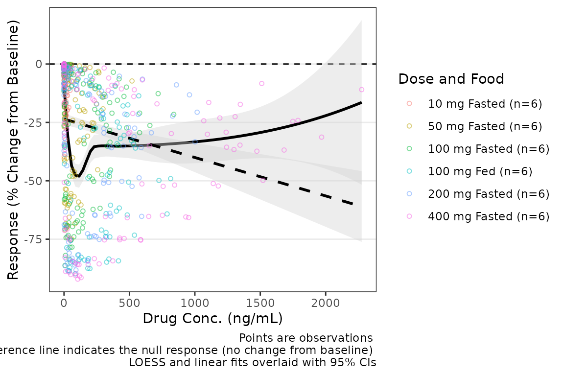 Additional arguments can be passed to
geom_smooth(method = "loess"), such as increasing the span
of the smoothing fit.
plot_dvconc(data = filter(plot_data_pd, CMT == 3), dv_var = "CFB", idv_var = "CONC",
xlab = "Drug Conc. (ng/mL)", ylab = "Response (% Change from Baseline)",
cfb = TRUE, col_var = "Dose and Food", col_trend = FALSE,
loess = TRUE, linear = FALSE, se_loess = TRUE, se_linear = FALSE,
span = 1) 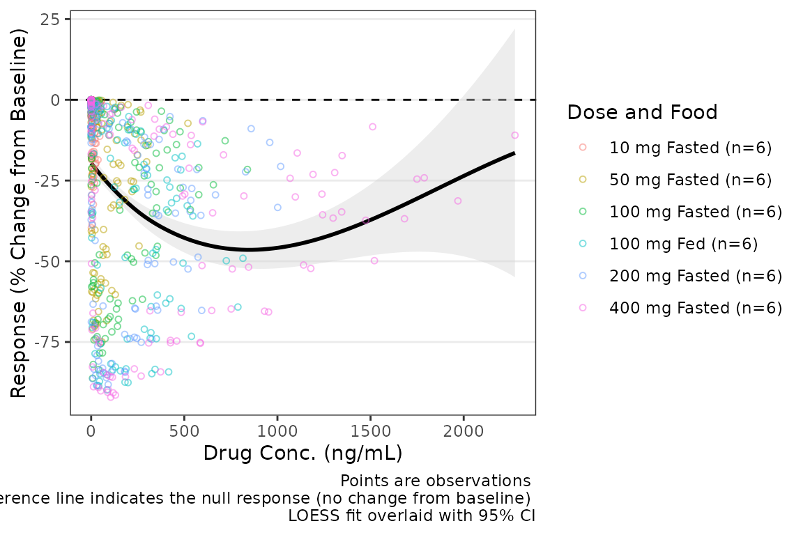 If the color aesthetic is mapped to the trendlines with
col_trend = TRUE, it will also map to the ribbons defining
the CIs of the trend lines.
plot_dvconc(data = filter(plot_data_pd, CMT == 3), dv_var = "CFB", idv_var = "CONC",
            xlab = "Drug Conc. (ng/mL)", ylab = "Response (% Change of Baseline)",
            cfb = TRUE, col_var = "Dose and Food", col_trend = TRUE,
se_loess = TRUE) 
Dose-proportionality Assessment: Power Law Regression
Another assessment that is commonly performed for pharmacokinetic data is dose proportionality (e.g., does exposure increase proportionally with dose). This is an important assessment prior to population PK modeling, as it informs whether non-linearity is an important consideration in model development.
The industry standard approach to assessing dose proportionality is power law regression. Power law regression is based on the following relationship:
This power relationship can be transformed to a linear relationship to support quantitative estimation of the power () via simple linear regression by taking the logarithm of both sides:
NOTE: Use of natural logarithm and log10 transformations
will not impact the assessment of the power and will only shift the
intercept.
This approach facilitates hypothesis testing via assessment of the 95% CI around the power () estimated from the log-log regression. The null hypothesis is that exposure increases proportionally to dose (e.g., ) and the alternative hypothesis is that exposure does NOT increase proportionally to dose (e.g., ).
Interpretation of the relationship is based on the 95% CI of the estimate as follows:
- 90% CI includes one (1): exposure increases proportionally to dose
- 90% CI excludes one (1) & is less than 1: exposure increases less-than-proportionally to dose
- 90% CI excludes one (1) & is greater than 1: exposure increases greater-than-proportionally to dose
This assessment is generally performed based on both maximum concentration (Cmax) and area under the concentration-time curve (AUC). While not a hard and fast rule, some inference can be drawn about which phase of the pharmacokinetic profile is most likely contributing the majority of the non-linearity of exposure with dose.
- AUC = NOT dose-proportional | Cmax = dose-proportional = elimination phase
- AUC = dose-proportional | Cmax = NOT dose-proportional = absorption phase (rate)
- AUC = NOT dose-proportional | Cmax = NOT dose-proportional = absorption phase (extent)
These exploratory assessments provide quantitative support for structural PK model decision-making. Practically speaking, non-linearities in absorption rate are rarely impactful, and the modeler is really deciding between dose-dependent bioavailability and concentration-dependent elimination (e.g., Michaelis-Menten kinetics, target-mediated drug disposition [TMDD])
Step 1: Derive NCA Parameters
The first step in performing this assessment is deriving the
necessary NCA PK parameters. NCA software (e.g., Phoenix WinNonlin) is
quite expensive; however, thankfully there is an R package for
performing NCA analyses: PKNCA.
Refer to the documentation for the PKNCA packge for
details. This vignette will not provide a detailed overview of
PKNCA functions and workflows.
First, let’s set the options for our NCA analysis and define the
intervals over which we want to obtain the NCA parameters.
data_sad is a single ascending dose (SAD) design with a
parallel food effect (FE) cohort; therefore, our interval is [0,
]
##Set NCA options
PKNCA.options(conc.blq = list("first" = "keep",
                              "middle" = unique(data_sad$LLOQ[!is.na(data_sad$LLOQ)]),
                              "last" = "drop"),
              allow.tmax.in.half.life = FALSE,
              min.hl.r.squared = 0.9)

##Calculation Intervals and Requested Parameters
intervals <-
  data.frame(start = 0,
             end = Inf,
             auclast = TRUE,
             aucinf.obs = TRUE,
             aucpext.obs = TRUE,
             half.life = TRUE,
             cmax = TRUE,
             vz.obs = TRUE,
             cl.obs = TRUE
             )
Next, we will set up our dose and concentration objects and perform
the NCA using PKNCA
#Impute BLQ concentrations to 0 (PKNCA formatting)
data_sad_nca_input <- data_sad %>%
  mutate(CONC = ifelse(is.na(ODV), 0, ODV),
         AMT = AMT/1000) #Convert from mg to ug (concentration is ng/mL = ug/L)

#Build PKNCA objects for concentration and dose including relevant strata
conc_obj <- PKNCAconc(filter(data_sad_nca_input, EVID==0), CONC~TIME|ID+DOSE+PART)
dose_obj <- PKNCAdose(filter(data_sad_nca_input, EVID==1), AMT~TIME|ID+PART)
nca_data_obj <- PKNCAdata(conc_obj, dose_obj, intervals = intervals)
nca_results_obj <- as.data.frame(pk.nca(nca_data_obj))
glimpse(nca_results_obj)
#> Rows: 648
#> Columns: 8
#> $ ID       <dbl> 1, 1, 1, 1, 1, 1, 1, 1, 1, 1, 1, 1, 1, 1, 1, 1, 1, 1, 2, 2, 2…
#> $ DOSE     <dbl> 10, 10, 10, 10, 10, 10, 10, 10, 10, 10, 10, 10, 10, 10, 10, 1…
#> $ PART     <chr> "Part 1-SAD", "Part 1-SAD", "Part 1-SAD", "Part 1-SAD", "Part…
#> $ start    <dbl> 0, 0, 0, 0, 0, 0, 0, 0, 0, 0, 0, 0, 0, 0, 0, 0, 0, 0, 0, 0, 0…
#> $ end      <dbl> Inf, Inf, Inf, Inf, Inf, Inf, Inf, Inf, Inf, Inf, Inf, Inf, I…
#> $ PPTESTCD <chr> "auclast", "cmax", "tmax", "tlast", "clast.obs", "lambda.z", …
#> $ PPORRES  <dbl> 277.7701457207, 13.4300000000, 7.8100000000, 35.9500000000, 3…
#> $ exclude  <chr> NA, NA, NA, NA, NA, NA, NA, NA, NA, NA, NA, NA, NA, NA, NA, N…
The NCA results object output from PKNCA is formatted
using the variable names in SDTM standards for the
PP domain (Pharmacokinetic Parameters). This NCA output
dataset is also available internally within pmxhelpr as
data_sad_nca with a few additional columns specifying
units.
glimpse(data_sad_nca)
#> Rows: 612
#> Columns: 11
#> $ ID         <dbl> 1, 1, 1, 1, 1, 1, 1, 1, 1, 1, 1, 1, 1, 1, 1, 1, 1, 2, 2, 2,…
#> $ DOSE       <dbl> 10, 10, 10, 10, 10, 10, 10, 10, 10, 10, 10, 10, 10, 10, 10,…
#> $ PART       <chr> "Part 1-SAD", "Part 1-SAD", "Part 1-SAD", "Part 1-SAD", "Pa…
#> $ start      <dbl> 0, 0, 0, 0, 0, 0, 0, 0, 0, 0, 0, 0, 0, 0, 0, 0, 0, 0, 0, 0,…
#> $ end        <dbl> Inf, Inf, Inf, Inf, Inf, Inf, Inf, Inf, Inf, Inf, Inf, Inf,…
#> $ PPTESTCD   <chr> "auclast", "cmax", "tmax", "tlast", "clast.obs", "lambda.z"…
#> $ PPORRES    <dbl> 277.7701457207, 13.4300000000, 7.8100000000, 35.9500000000,…
#> $ exclude    <chr> NA, NA, NA, NA, NA, NA, NA, NA, NA, NA, NA, NA, NA, NA, NA,…
#> $ units_dose <chr> "mg", "mg", "mg", "mg", "mg", "mg", "mg", "mg", "mg", "mg",…
#> $ units_conc <chr> "ng/mL", "ng/mL", "ng/mL", "ng/mL", "ng/mL", "ng/mL", "ng/m…
#> $ units_time <chr> "hours", "hours", "hours", "hours", "hours", "hours", "hour…
We will need to select the relevant PK parameters from this dataset
for input into our power law regression analysis of
dose-proportionality. Thankfully, pmxhelpr handles the
filtering and power law regression in one step with functions for
outputting either tables or plots of results!
Step 2: Perform Power Law Regression
The df_doseprop function is a wrapper function which
bundles two other pmxhelpr functions:
-
mod_logloga function to perform log-log regression which returns almobject -
df_logloga function to tabulate the power estimate and CI which returns adata.frame
There are two required arguments to df_doseprop.
-
dataadata.framecontaining NCA parameter estimates -
metricsa character vector of NCA parameters to evaluate in log-log regression
power_table <- df_doseprop(data_sad_nca, metrics = c("aucinf.obs", "cmax"))
power_table
#>   Intercept StandardError  CI Power   LCL  UCL Proportional
#> 1      4.04        0.0663 90% 0.997 0.888 1.11         TRUE
#> 2      1.09        0.0616 90% 1.070 0.967 1.17         TRUE
#>                            PowerCI    Interpretation   PPTESTCD
#> 1 Power: 0.997 (90% CI 0.888-1.11) Dose-proportional aucinf.obs
#> 2  Power: 1.07 (90% CI 0.967-1.17) Dose-proportional       cmax
The table includes the relevant estimates from the power law regression (intercept, standard error, power, lower confidence limit, upper confidence limit), as well as, a logical flag for dose-proportionality and text interpretation.
Based on this assessment, these data appear dose-proportional for both Cmax and AUC! However, we should not include the food effect part of the study in this assessment, as food could also influence these parameters, and confounds the assessment of dose proportionality. The most important thing is to understand the input data!
Let’s run it again, but this time only include
Part 1-SAD.
power_table <- df_doseprop(filter(data_sad_nca, PART == "Part 1-SAD"), metrics = c("aucinf.obs", "cmax"))
power_table
#>   Intercept StandardError  CI Power   LCL  UCL Proportional
#> 1      3.97        0.0438 90% 0.979 0.907 1.05         TRUE
#> 2      1.06        0.0616 90% 1.060 0.959 1.16         TRUE
#>                            PowerCI    Interpretation   PPTESTCD
#> 1 Power: 0.979 (90% CI 0.907-1.05) Dose-proportional aucinf.obs
#> 2  Power: 1.06 (90% CI 0.959-1.16) Dose-proportional       cmax
In this case, the interpretation is unchanged with and without
inclusion of the food effect cohort. df_doseprop provides
two arguments for defining the confidence interval.
-
method: method to derive the upper and lower confidence limits. The default is"normal", specifying use of the normal distribution, with"tdist"as an alternative, specifying use of the t-distribution. The t-distribution is preferred for analyses with smaller sample sizes -
ci: width of the confidence interval. The default is0.90(90% CI), which is used in the bioequivalence criteria, with0.95(95% CI) as an alternative
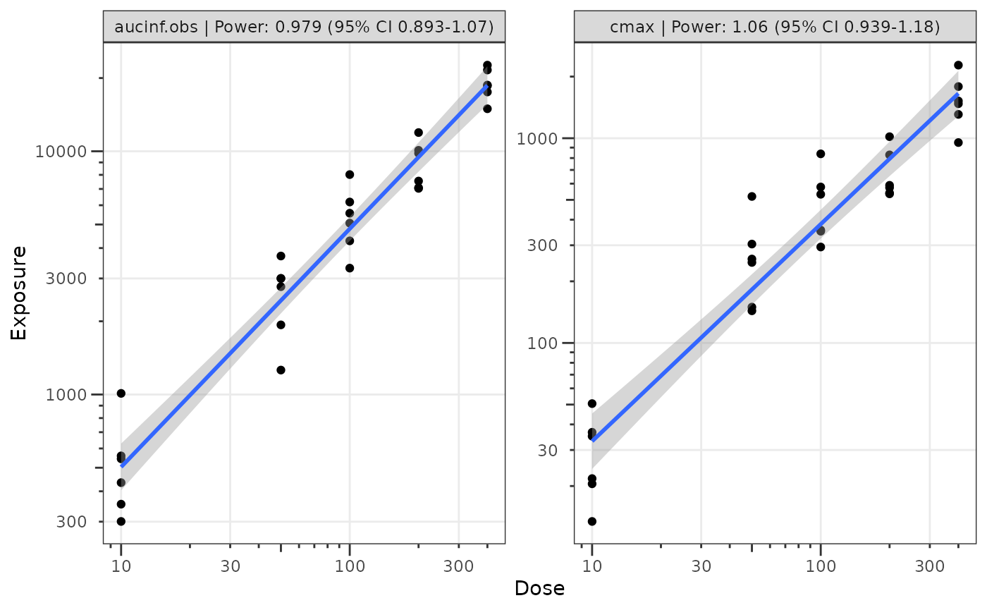
Step 3: Visualize the Power Law Regression
We can also visualize these data using the plot_doseprop
function. This function leverages the linear regression option within
ggplot2::geom_smooth() to perform the log-log regression
for visualization and pulls in the functionality of
df_doseprop to extract the power estimate and CI into the
facet label.
The required arguments to plot_doseprop are the same as
df_doseprop!
plot_doseprop(filter(data_sad_nca, PART == "Part 1-SAD"), metrics = c("aucinf.obs", "cmax"))